My name is Michael Coleman and I’m a designer by day, horror
fanatic by night. in this two-part series I hope to take you on a thrilling
trek through the tomes of The Design of Horror.
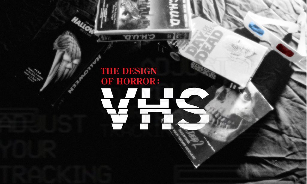
In my last installment I trudged with you through the creepy crypts of poster design ranging from Art Nouveau to Contemporary design. In this sequel installment I will be discussing the phenomenon that was the VHS cover.
Before the days of home video viewers had few options for
seeing their favorite slashers and thrillers. You could either hope and pray it
would be featured on a late-night horror host’s line up, visit a nearby theater,
or operate an expensive home projector.
Everything changed for the American consumer in 1977 when the
home movie, or VHS was released on the market. Movies of all kinds were now
available to view on demand. It was thanks to this new found convenience that
the horror genre found a wider audience than ever before.
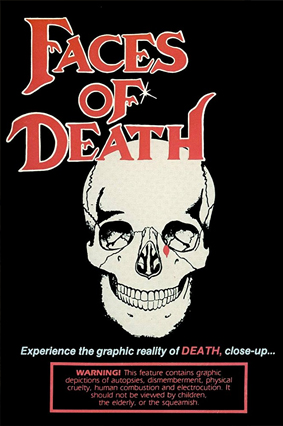
Horror films could now be produced not just for the theater, but also for the new direct to video market. Films that would never see the box office due to their extreme nature, low quality, or general lack of budget could simply be produced for home video – a common occurrence for gruesome films such as Faces of Death. Following the pattern of the theater poster, the more intense the film the more outlandish or striking the design.
Faces of Death (1978)
The environment of a video rental store was much more competitive than that of the movie theater. With genre sections displaying dozens if not hundreds of titles to choose from,a designer had to make sure the cover caught the eyes of the customer. While some covers simply adopted their theater poster’s design other films took to the challenge with unbridled enthusiasm and creativity- creating great symbolism and design.
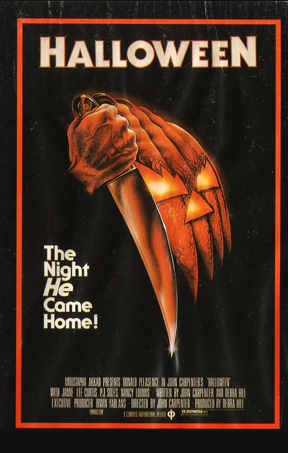
The cover for John Carpenter’s Halloween is one such design. A beautifully painted image, and bold sans serif type tell us all we need to know about the film. It’s Halloween night, there is a killer coming for our protagonists, and it’s going to be a no-nonsense ride from here to the very last scream. Note the monochromatic color scheme, and the way the artist matches the shape of the knife against the jack-o-lantern’s smile perfectly – finishing both it’s grin and echoing the shape of knife wielder’s hand.
Halloween (1978)
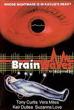
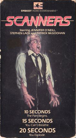
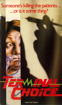
Designers often utilized the power of creative typography for more captivating covers. The cover for the Embassy Home entertainment release of Final Exam for instance uses the smart addition of a knife to further illustrate against the otherwise modern use of photo montage and clean Swiss type. The red italic type and the line beneath add a sense of movement and excitement assuring us (perhaps falsely) that we are in for an exciting wild ride. Designers for films such as Brain Waves, Scanners, and Terminal Choice all utilize the shape of their letter forms to suggest their sub-genre, or the content of their films.
Brainwaves (1982)
Scanners (1981)
Terminal Choice (1985)
Other tactics employed were color and contrast. Color was
effective in communicating content and themes to be found within a movie. Lots
of red used in the design ensures the film will be a blood bath, blue schemes
depict technology and paranormal occurrences, and green shifts towards genres
like science fiction or zombie films. Contrast didn’t always take the form of
chiaroscuro pitting light against darkness. Some designers surprised their
viewers with contrasting themes.
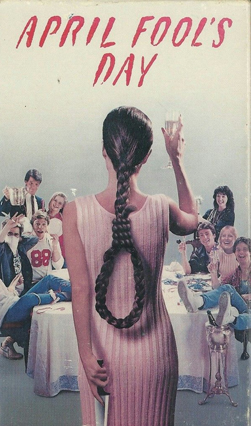
Take April fools Day for example. Sporting a pastel – like muted color palette of pinks and blues we are instantly subdued into a false comfort. The scene at first glance seems like a group of friends happily greeting a newcomer in a dress. Pretty tame so far. As our eye moves down the center of the composition however, we are left at the knife in their hand. And at a second glance we see her hair has been braided into a noose, the symbol of death. As a potential viewer we are then prompted to see how these contrasting themes are to play out.
April Fools Day (1986)
The VHS market had a good long run – officially going from 1977 till 2007 with the Disney release of Cars. One might think the format is long dead and buried. Don’t be fooled though – much like a wretched ghoul appearing when you least expect it – VHS design still lives in the day of Blu-ray and digital streaming. Digital artists still create VHS releases for modern day movies, and independent studios are releasing films on cassette like DVD’s never happened. Much like the monster under your bed, or the ghost outside the window – VHS is still there if you dare to peek between your fingers.
About the author: My name is Michael Coleman, and I am a graphic designer, AIGA board member, film lover, and pickle maker. If you missed out on the previous installment of The Design of Horror, you can find it here. If you liked what you just read, feel free to visit my portfolio website.