What is it about the grotesque and bizarre that keeps us so tantalized? Is it morbid curiosity, or the thrill of the grave? Hitchcock himself said “I think everyone enjoys a nice murder, provided he is not the victim.” Sage words, Alfred. Over the course of this series I will be discussing the different aspects of the visual elements of horror, and what about them keeps us coming back for more.
My name is Michael Coleman, and I’m a designer by day, horror fanatic by night. in this two part series I hope to take you on a thrilling trek through the tomes of The Design of Horror.
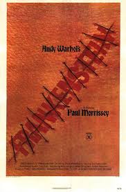
Andy Warhol’s Frankenstein (1973)
The poster
Film viewers, in the days before the internet, had to rely on posters hung outside a theater to relay much of a movie’s information. The designers of these posters had to create stunning imagery that would grab their audiences’ attention — not an easy task when set afloat into a sea of competing movie titles. It was only made more difficult by the fact that a good deal of these horror movies were B – Grade flicks; low budget horror movies with gimmicky monsters, cheap effects, and even cheaper acting. The show must go on, however, and it was the designer’s job to help communicate just why you should be spending your hard-earned allowance to see Flesh for Frankenstein instead of Attack of the Giant Leeches.
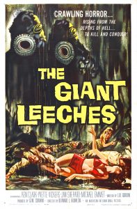
The Giant Leeches (1958)
One motif found in a great deal of early horror posters is large swooping hand-painted type. Before the 1960’s brought Modernism as the design style of choice, custom painted letterforms were king. They would rip across the canvas, announcing the film’s title with a shill shriek, or a solemn moan. Jagged, dripping, and often three dimensional, these monsters of letterforms let their audiences know that they were in for a scare.
Another common visual element was the hulking villain. Taking up a third, or more of the poster’s canvas, and matching a movie goer’s stares with a grave born glare; they were impossible to ignore. With the top of the poster belonging to the antagonist, and the center being where the title lays, the bottom was often left for the secondary information and the supporting cast to make their appearances–often reacting in horror to the villain’s dread visage.
An expressive approach was taken for the use of color, with burning complimentary greens and reds depicting rotten flesh; and fountains of blood. The title might be three dimensional, with a flashy yellow or bone white to contrast against the carnage of the background and drive home the excitement of what you are about to witness.
With the coming of Modernism, different methods of portraying the contents of a film came about as well. Photomontage, long favored by the Dadaists, futurists, and constructivists became a commonplace element in film-based advertisements. A notable example of such poster design is The Texas Chainsaw Massacre, featuring the chainsaw wielding “Leather Face” repeated across the poster, giving it a great sense of pattern, movement, and gritty style. Films such as Rosemary’s Baby could rely on simplistic, photo-based imagery and striking color to get their intended emotion across, paired with clean swiss typography.
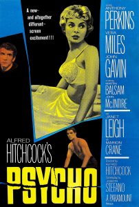
Psycho (1960)
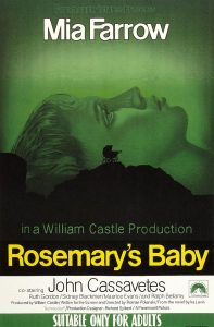
Rosemary’s Baby (1968)
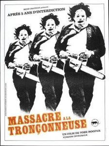
Massacre Trançonneuse (Texas Chainsaw Massacre 1974)
Today’s horror movie fanatic traverses a landscape saturated with advertisements. Our devices and televisions showcase trailers and commercials, while our commutes have full video billboards and posters incorporated into them. Today’s designer has more avenues than ever to communicate the terrifying tales in films to come. So stay on the edge of your seat, and stay scared!
-Michael Coleman