How do you design for 20+ user personas, for residents across multiple cities, or all 6.75 million people living in a state? Earlier this month we teamed up with MassIT to show off the proposed redesign of Mass.gov, and invite members of the design community to give feedback on this ongoing project.
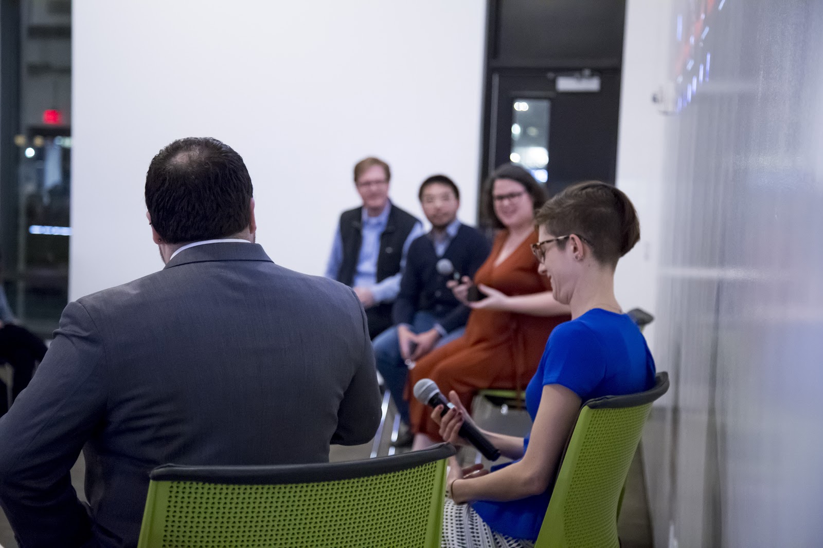
Harlan Weber, Director of Design & Innovation at MassIT, and Nedrit Sahin, Senior User Experience Designer at Velir, took the audience of Redesigning Mass.gov through their process.
Process — MassIT + Velir
Before jumping into feedback from the panel and the audience, Harland took how they arrived at the design.
Apart from the analytics they collected, the team took to the streets to get the insights they needed. They visited all of the different agencies across the state, connected with the content creators to hear about their processes, and visited places such as the Perkins Institute for the Blind to test the site with people who use assistive technology as part of their web experience.
The process amassed tons of data. “I can literally never do enough research,” Harlan noted. The event itself, where they opened the floor to critique from the audience, is a testament to the ongoing research process of the redesign.
Information Architecture
“The government can be a big, confusing place” said Harlan while describing the information architecture of the site. The major focus of Mass.gov’s redesign was creating an experience that was easy to navigate. The team at Velir started out by identifying 21 different user personas before realizing this wouldn’t be the most effective approach, as parents can also be taxpayers, and business owners might also visit state parks. They soon realized the personas didn’t accurately represent how people would use the site.
The team needed a new way to map out the paths users could take. Inspired by newly redesigned Boston.gov, the team switched to the “jobs to be done” framework in order to create pathways for constituents to achieve their goals on the site.

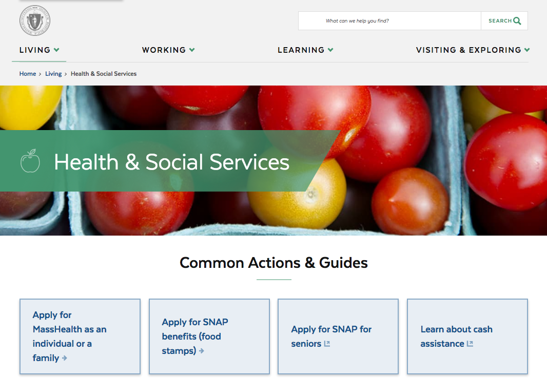
Inside page of Mass.gov redesign
Jobs include everything from visiting Massachusetts national parks to filing taxes. The team identified the categories the jobs would fall under: Living, Working, Learning, and Exploring and Visiting. These cover all the jobs residents, business owners, parents, students, tourists need to execute on Mass.gov. The team created two types of pages: how-to pages and narrative guides.
For example, how-to pages work great for laying out each step needed to apply for unemployment. For content that is less task-oriented, like outlining the benefits of unemployment, the narrative guide is more suitable.
Brand
The team created an experience that wove into their four brand pillars: modern, human, dignified and helpful. Their focus on usability builds brand trust with the many people who will visit.
Visually, the proposed redesign is refreshing. Dense information is balanced with whitespace. Contemporary colors and typography feel relevant.
They’re faced with a tough challenge to rebrand the site, while not rebranding the state. Since the site is the main way most people will interact with the state, a balance needs to be struck. The team showed the audience a few concepts for logo designs.
One mark featured the shape of the state, another was simply “Mass.gov” stacked between bars and finally, “Mass.gov” treated to represent the city name signs found on Massachusetts routes. These designs sparked a lively critique from the audience.

Some felt that the logos and visual brand were an afterthought compared to the care taken in researching leading up to the information architecture. While others, like our panelist Dani Nordin, pointed out that user experience on any website is key to a positive feeling about a brand.
Despite the critiques, everyone who shared their thoughts acknowledged the massive scope of this project and also their appreciation for the open forum. This event was just the beginning, the Mass.gov site is still very much a work in progress and MassIT is accepting feedback and ideas through their email MassITDigitalServices@MassMail.State.MA.US.
Be sure to check out MassIT’s recap of the event.
Sarah Croughwell is a User Experience Researcher at Motivis Learning and the Communications Director for AIGA Boston. Guided by curiosity, Sarah explores the intersection of design and the social sciences both in her work and in her observation. You can follow her on Twitter, Dribbble, and Instagram.
—
Designs from: pilot.mass.gov
Photos provided by: MassIT