A message from our chapter sponsor,
Lesley University
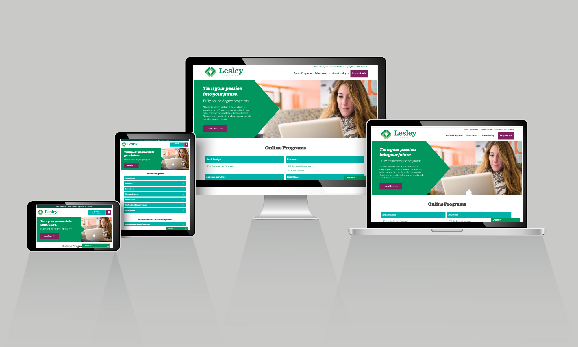
Understanding UX: What Is Responsive Design?
Devices have outgrown a one-size-fits-all design. Today, people expect an elegant and consistent experience across platforms. Responsive design provides the optimal user experience for each channel, whether it’s a desktop computer, smartphone, or tablet. According to HubSpot, smartphone internet consumption grew by 78 percent between December 2013 and December 2015. During that same time period, desktop internet consumption dropped by 1 percent. Consequently, responsive design is no longer a recommendation, it is necessary to create the optimal user experience. For those interested in entering the user experience (UX) design field, it is important to understand that good design and responsive design are one and the same.
About Responsive Design
In the modern tech landscape, designers must develop content to be viewed on a variety of screen sizes and devices. As more options become available, people often use multiple devices to browse the web in their daily lives. As a result, individuals expect a responsive experience. UX designers are tasked with much more than resizing content to fit diverse screen sizes, however. Effective design starts with thoughtful planning that considers how devices are used. For example, UX Magazine points out that “smartphones are personal; they are used mostly for micro-tasks, acting on locally available info, entertainment, and social sharing.” Because tablets are often shared among multiple users, “they are considered an [alternative] to laptops and are primarily used for content consumption.” UX designers are therefore tasked with adapting the experience for each context of use.
At its core, that is the basis of responsive design. As Lisa Spitz, program consultant for the College of Art and Design at Lesley University, puts it, “Responsive design is a website’s ability to respond to the needs of individuals who are accessing websites from various contexts and devices.” Spitz says that a UX designer must carefully consider both context and device, creating an experience that is able to transform gracefully.
In responsive web design, a site’s layout changes with the device: “A wide screen display can receive a site design with multiple columns of content while a small screen can have that same content presented in a single column with text and links that are appropriately sized to be read and used on that smaller display,” according to Awwwards, which recognizes the best examples of UX design around the world. To provide the best user experience possible, a site must function dynamically, regardless of how the individual has chosen to interact with it, via desktop or mobile device.
Design should be able to scale up or down, both in terms of resolution and the amount of content displayed. Beyond only having a flexible layout, responsive design also incorporates multiple levels of content that change according to context and device. This is beneficial because, “as new devices hit the market with screen sizes unlike what we have seen before, our responsive websites will already be prepared to meet those new devices with a design and experience best suited to whatever screen sizes [are released],”,” Awwwards points out.
Mobile-First Design
An important component of responsive design is the “mobile-first” approach. Because of the wide variety of devices available today, people are browsing the web in different ways. Many of these devices are mobile, making a “mobile-first” approach to design one of the ways UX designers can create a responsive experience. Mobile-first design is the “ideology that mobile design, as the hardest, should be done first. Once the mobile design questions are answered, designing for other devices will be easier … the smallest of the designs will have only the essential features, so right away you have designed the heart of your UX,” according to UXPin, the creators of a collaborative platform that helps teams design innovative products.
Spitz also points out that starting with mobile means working with stricter specifications and limitations in terms of what can be easily viewed and elegantly displayed. This makes prioritization key, with designers including the most important elements first and then adding more as device displays allow. Rather than beginning with desktop design and then removing features and content for mobile platforms, mobile-first design asserts that if a design is effective on a mobile device, it will translate better to other types of devices, UXPin says.
Designing With the User in Mind
Truly responsive web design goes beyond understanding the technical elements involved, however. It also incorporates a deep knowledge of the user. “You really need to know who it is that you’re designing for. What are their requirements, what are their needs, what are their situations so that you can create something intuitive,” Spitz says. “I often run through the mnemonic ‘who, what, where, when, why, and how’ when I start a project. This helps me to understand … what their context of use is and what is important about their stated or unstated needs.”
At the same time, it’s also important to meet business goals. This balance can be achieved with careful research and planning, along with incorporating responsive design. “The best sites walk the line between user experience and driving the bottom line,” Spitz notes. “It would be neglectful not to design with your end users in mind. After all, they are the ones buying your products and services. They are the ones you want to make happy if you want your business to succeed.”
Part of what makes contextual research so important when it comes to design is that today’s users have high expectations. “We don’t necessarily expect it to work the same across devices, but we do expect it to be intuitive. I think people value an experience that seems to predict their needs and respond accordingly. And if there’s some element of delight or added value inherent in that experience, they’ll take notice,” Spitz says.
User-centric design is about providing “the right content, on the right device, at the right time,” UX Magazine says. Designers have to understand the context in which devices are used to create suitable experiences. That’s why designers should look to the user when deciding which content and functionality to show on various devices, according to the Nielsen Normal Group, a leading user experience company. With so many device options available and technology evolving at a rapid pace, creating responsive design solutions is the most effective way to meet the needs of individuals while creating forward-thinking, future-ready designs.
Responsive website design is central to providing a better user experience. Lesley University’s online BS in Design for User Experience program prepares professionals to master the essentials of the digital media marketplace. The curriculum focuses on graphic design principles and collaborative approaches, preparing graduates to use critical thinking and interdisciplinary approaches to design intuitive experiences. You can learn more about this program here.
All images created by the in-house team at Lesley University Online.

