Vaughan Oliver’s body of work has shaped the world of music. His work for bands like The Pixies, This Mortal Coil, Modern English and the Throwing Muses shaped the visual language of a genre. Elevating the Banal explored Oliver’s impact on music design. Our panel was moderated by Kristina Lamour Sansone and comprised of designers Timothy O’Donnell, Kenneth FitzGerald, Clif Stoltze and Timothy Samara. It was part celebration, part history and part reflection of the music packaging in its heyday. Each of the speakers shared their own insights into the work but each seemed to revolve around a few central themes.
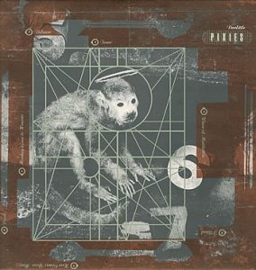
The Pixies, Doolittle Album designed by Vaughan Oliver (1989)
History & the Heyday of Music Packaging
Oliver’s work is rooted in anything other than traditional design practices. The speakers shared about being misfits and artmakers wondering if the rigid swiss modern design style they signed up for in college was right for them–and then discovering the work of 4AD.
Clif Stoltze shared his experience of collecting albums and the discoveries he made in the record stores. In a quick history lesson, he shared that punk music emerged as a response to the slick and produced art of pop music. The layered textures, images, and type became a signature of 4AD records. Timothy Samara compared the works of Oliver to the surrealist work of Man Ray and Kandinsky.
Oliver was able to use methods of “artistic victories” throughout history to capture the feeling of the music. Samara pointed out that Oliver’s work was not a retreat into history but “to look to the past to cut away from what currently is, what is worn with it and what they are dissatisfied with.”
Innovation in the Unexpected
Music packaging bridges the gap between art and commerce–two things that can often be at odds with each other. Timothy O’Donnell shared the experience of working for Vaughan Oliver. The process was about making connections where there might not be something obvious. The layered textures or type as images are evidence of Oliver’s hunger to learn about photography, theater, painting or poetry.
Samara made this connection earlier with the comparison of the album art to the work of past artists. Kenneth FitzGerald shared the images of Russian spacecraft to illustrate a similar point. They represented what happens when the form can express itself without heavy reference to what the function is. The work that emerges from the unexpected is what captures the look of the music’s sound. Vaughan is a master of creating these “compelling and disturbing forms.”
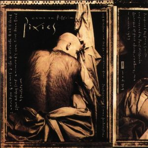
The Pixies, Come On Pilgrim designed by Vaughan Oliver (1987)
Defining Beauty in the Banal
Every speaker mentioned the ritual of flipping through records at the store and finding the ones designed by 4AD. Each an artifact representing emotions, music, and beauty. O’Donnell talked about Oliver removed the barcode on the back of an album and how it enriched the experience. O’Donnell equated the barcode to the exit sign in a movie theater. You know why it’s there but it takes the viewer out of the immersive experience of the film. A small change that took the artwork to the next level.
Kenneth FitzGerald explored the scales at which design operates. He calls it the design equalizer. In this way, all designed work is placed in context, including Oliver’s. Work can be businesslike or bohemian, wild or tame, nostalgic or futuristic, etc. He examined the design of a lost cat poster next to a detailed quarterly report and what the contrasting forms mean for the function of the artifact.
In pop culture, things strive to sell more than they can offer–be more than they are, and the purpose of creating beautiful objects is to give a reason for someone spend time with it. The modernist design movement sought to put structure and order to everything so that it would be universally understood. Samara even said “Graphic designers talk about beauty as a clean perfection” There is a messiness to human life that is not often captured in design except in the objects like the ones created by Vaughan Oliver.
Record stores were more than just places to buy music, they were places of exploration and connecting with other people. Vaughan Oliver’s work was the discovery and inspiration for the designers on the panel. His work captured the feeling of the music it represented in ways that other record companies couldn’t quite manage. Oliver’s work is successful because it seeks nothing more than to be what it is.
Check out Vaughan Oliver: Walking Backwards on view at the Lunder Arts Center, Lesley University through October 22.