On February 1st, AIGA invited web typographer Jason Pamental to speak about the history of typography, it’s relationship with graphic design and the breakthrough that is variable fonts. He is the Director of Design and Digital Strategy at Isovera in Waltham.
The Word of God
To start the presentation, Jason began with the history of typography. Before the Internet, computers, or the printing press, typography was a sanctified practice. The written word was saved for religious text and because the texts were written in honor of a higher power, the typography was beautiful, varied, and intentional. Every variation in the thickness of the lettering to the intricate symbols at page ends was well thought out. Fonts were highly diverse and added personality to the content.
Whether the content speaks God’s word or relays the daily local news, the typography of the piece has a profound effect on your reading experience. As Jason put it, “Unless you’re watching a cat video, you’re probably going to be reading something. And the way that type gets on screen and the way you see it is going to profoundly impact the way you understand it.” For example, the font style alters the mood of the writing, while the variation of boldness places importance on certain sections over others. The reader could have a completely different reading experience depending on the typography. Jason stressed, “Typography is design. It is communication. It has to be intentional.”
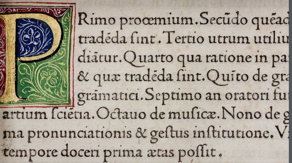
Illustrated Manuscripts illustrated sacred typography
Typographic Mass Extinction
Typography never lost its importance in print, but for the web, it took a backseat. Jason pulled up an example of magazine covers in print. The covers were framed in a plethora of fonts with multiple faces and many different weights. He then pulled up an example of a popular webpage and pointed out that it had less than half of the different faces and weights as the magazines.
There are challenges to web typography that aren’t present in print that cause web typography to be watered down, thinned out and less diverse. Jason has broken down these challenges into “The Three Dragons of Typography”.
Dragon Number 1: Understanding Typography
Dragon number 1 is web designers’ knowledge of typography. Most web designers come into the profession through channels other than graphic design and have never taken a class on typography. Jason says that he has hosted web conferences on graphic design where half the room was full of web designers. “If I asked [people at a web conference] to keep your hands up anyone who has actually taken a class in typography, there might be three hands up out of 100 or 200 or 300 and that’s very typical on the web.”
While performance is important, the fonts used and the design of a page strongly influence the reader’s reaction to what they’re reading. As Jason put it, “Typography is either going to strengthen the meaning of what you’re trying to get across or it is going to dilute it. It is never going to be neutral.” So in order for designers to create great web typography, designers need to add together a few typographic techniques that are often overlooked, including the new technology of variant fonts.
Dragon Number 2: The Battle Between Design and Performance
Dragon number 2 is the tension between design and performance on the web. Both affect the user experience, but performance often wins most of the designers’ attention.
With the launch of type kit in 2009, designers were able to bring back some range to web typography. Each new font file added a level of personality to the design but it also created massively heavy folders to load.
This is still a problem today. If a webpage hasn’t fully loaded within 3 seconds, 53% of the mobile audience will leave the webpage. So it is understandable that developers would prioritize light files and fast loading times over attractive typography. But by doing this, we lose the individuality and the opportunity to set ourselves apart.
Now, there is a way to balance design and performance. Variable fonts are an evolution of the open type specification. As defined by John Hudson, “A variable font is a single file that behaves like many.” One font file gets cached onto every web browser. A variable font is the same size as a single font file that can be manipulated across an axis: width, weight, true italics, optical size, grade, and slant. When you manipulate the font across this axis, you can come up with endless varieties of fonts.
You can already play with variable fonts if you have the latest versions of Adobe Illustrator and Photoshop. They both already have support for variable fonts and even come with pre-downloaded samples. Another way to practice with them is through Axis-praxis.org, which has 18 or 20 different variable fonts that you can morph with the different sliders to customize the font.
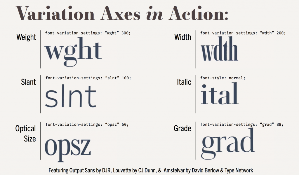
Variables of Type in Action
Dragon Number 3: Reacting to Context
Dragon number 3 is reacting to context. For example, an article viewed on a larger screen may flow nicely, but once that screen shrinks to a mobile phone view, the text could look choppy. When switching between languages as well, such as German that has longer words that don’t react well to hyphenation.
Like a knight in shining armor, variable fonts can slay this dragon too. By changing the width of the text to be narrower, more words can fit per line and create a smoother reading experience. It is all about adding up many different typographic techniques to create the best reading experience in many different conditions.
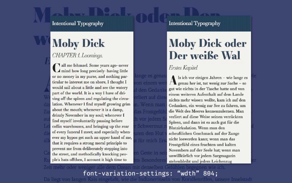
Variable fonts for Moby Dick in English and German
Into the Unknown
More species of fonts are evolving and bringing diversity to the web. As of right now, variable fonts are available on half of the web browsers including Chrome, Windows, and Safari but will soon be available on more. We still don’t know where this technology will take us. Jason predicted, “We still don’t really know how good it will be and over time it is only going to get better.”
As with most inventions, over time new uses for the invention arise. Jason provided an example of how the technology could evolve to communicate the grade of the text with the ambient light sensor in smartphones. The grade changes the thickness of the stroke and creates a contrast between the foreground, the letters, and the background. With the help of the ambient light sensor, the grade of the text could adapt with the lighting in the room and make the text more readable. This is only one idea of a path that variable fonts could take and there are likely to be many more. Only time will tell where this innovation will take us.
Amanda Lenkauskas is a Boston-based freelance writer. When she’s not busy writing about the world around her, she can usually be found reading, planning dream vacations, or scouting out dessert. Learn more about Amanda on her LinkedIn.
Header image by Sarah Croughwell
Article images and slides by Jason Pamental