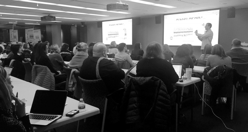
This workshop, held on February 9th at the NERD Center, was the third event in this year’s Take it From Me series. It proved to be absolutely amazing and very useful to both print and web designers. Brian Wood is a web developer and the author of 10 books covering Muse, Dreamweaver, InDesign, and Illustrator. He has trained many clients, including Nordstrom, REI, Boeing, Starbucks, and Nintendo. Brian shared some tricks and resources he uses while designing for web.
The workshop was broken down into two parts:
- Workflow + Grids + Tools
- SVGs + Fonts + Icon fonts
Workflow + Grids + Tools
The first part of the workshop was spent discussing workflow and tools. Brian suggested several tools to get you started on building your website.
Where to start
Brian started by explaining the difference between static, responsive, fluid, and adaptive designs, and why each has its place. He stressed that the decision to design mobile first or not should be based on how much and what type of information you have. Use Google Analytics to help you better understand your audience and the needs of your website or project.
He also suggested looking into design help tutorials from Google Developers Console which contains a library of videos and extra help.
Grids
Brian strongly advised working with grids for their flexibility and convenience. He stressed that it is better to use a template that someone else has created, as it saves you time and energy to not reinvent the wheel. Some grid templates he suggested include Gridpak and Responsive Grid System.
Prototyping
Brian recommends Marvel, or Axure if working on a large website. For prototyping and wireframing, keep an eye out for Adobe’s new tool: Project Comet.
Templates
Brian showed how tools like Photoshop and Illustrator could be used in designing for web. When working in Illustrator, your vector designs will be ready for retina screens. Also, Illustrator is great for creating grids. He suggested starting with a template, making sure to think about what platform you will be picking for the project (ex: mobile or desktop).
Pixels
According to our statistic tool, Stat Counter, 320 x 1024px is the most common mobile screen size while 1366 x 768px is most common desktop screen size. Use this tool if you want to know the most frequently used screen sizes on your website.
These days, retina displays play an important role when designing for web. It could mean that there are four times the amount of pixels that there used to be. As a result, your assets could be viewed at twice the size on certain devices. Because you need to consider multiple resolutions, it is best to use smart objects so they will scale.
Remember to consider the size of the files you are uploading, as processing speeds can be affected by large file sizes.
Working with developers
If you work with developers, it is beneficial for you to discuss your goals with them in order to increase your chances of success. One tool to help you throughout the project is a digital moodboard, like Niice. This helps you not only with style decisions, but with determining relationships and hierarchy on the website, and staying on the same page with your developers.
SVGs + Fonts + Icon Fonts
SVGs
Brian was eager to emphasize the power of SVGs and using Illustrator (where you can export SVGs) as a design tool for the web, as SVGs are infinitely scalable. Another option is to use PNGs, but SVGs are the best option because they have a smaller file size.
Smaller files
To challenge yourself on how good you are at minimizing the file size of your images, you can compare your best effort to what Tiny JPG can do.
Fonts
Brian recommended a few tools for working with fonts on the web:
- Sky Fonts or Google Fonts plug-ins for hosted fonts.
- Adobe Typekit has a library of hosted fonts, but you need Creative Cloud to use it.
- Font Squirrel has a lot of fonts available, but beware of licensing issues.
Icon fonts
Icon fonts contain symbols and glyphs that can be styled with CSS in the same way you style regular text.
Creative Cloud, Genericons, and Font Awesome either host the icon fonts and give you code, or you host them on your server.
Tools like Typicons, We Love Icon Fonts, or IcoMoon allow you to pick and download a set of icon fonts to use.
To sum it up
To conclude our event Brian suggested reading through a really good source for designing for the web here: www.uptodate.frontendrescue.org.
A huge thank you to our partner Adobe for a great workshop! You can download a PDF of the presentation here.
Follow AIGA Boston for news on the next installment of Take it From Me!
Our final event of the season will take place in April and cover freelancing.
About the Initiative:
Take it From Me is an event series organized by AIGA Boston giving students and emerging professionals the opportunity to interact with established professionals in the design field. This initiative will encourage engagement and discussion through a range of events—including workshops, panel discussions, roundtables, lectures, networking events, studio tours, online activities, etc.—that address different aspects of the design discipline. These events will provide newer designers the opportunity to ask questions, seek advice, and participate in career development focused activities, while giving established designers the opportunity to support the emerging design community. The Take it From Me series will create a structure that is self-perpetuating, providing tools and support for younger designers to develop rewarding careers and become tomorrow’s leaders.