The craft beer movement was born in Boston. From Boston Beer Company to Harpoon there are dozens, if not hundreds, of breweries across the state. You might have noticed in the aisles of your local grocery store-how amazing the packaging from craft beer has gotten. At AIGA Boston we LOVE craft beer. We wanted to know what that process is like from the liquid design of Mystic Brewery to the experiments going on at Nightshift, what makes good beer packaging? No two breweries are the same and we got to explore what makes a few Massachusetts breweries tick.
Michael and Tim Oxton were so kind as to get on the phone with me in order to talk about the design process at Night Shift Brewing in Everett, MA. Michael Oxton is one of the three co-founders of Night Shift Brewing and his brother Tim is the Creative Designer. They shared the story of the brewery paired with their philosophy of brewing and its visual design.
Night Shift started like all great passions: during weeknights after long days of work. For five years the co-founders Michael Oxton, Michael O’Mara and Rob Burns home brewed until it became viable to get a space and make a business out of it. Their passion for beer scaled along with their brewery.
Quality Everything
Now several years later, their brewery is hopping and it’s clear to see why. They try to do as much in-house as possible. Night Shift has a commitment to quality–not just of the beer but of the culture and community that emerged around it. They have independent control over all the pieces which fosters collaboration and experimentation, right down to the graphics on the can.
That’s where Michael’s brother Tim comes in. At the time when Night Shift was getting off the ground, Tim would step in to help with graphics. At first it was 5 hours, then 10, then 20 and then they had enough bandwidth for Tim to come on full time.
Be Innovators
The can structure itself is easy to spot on a shelf of craft beer, with the iconic owl on a field of vibrant art styles. Each can stands on its own but they all feel like they belong to the same family. With each beer, the team at Night Shift pushes the process in the spirit of experimentation. This leads to an interesting design process. The design of beer graphics are different from other product design. The label is finished before the beer is and the creators of the graphics don’t get to experience beer in the same way a visitor of the taproom might. So inspiration for the look and feel is found in some unexpected places.
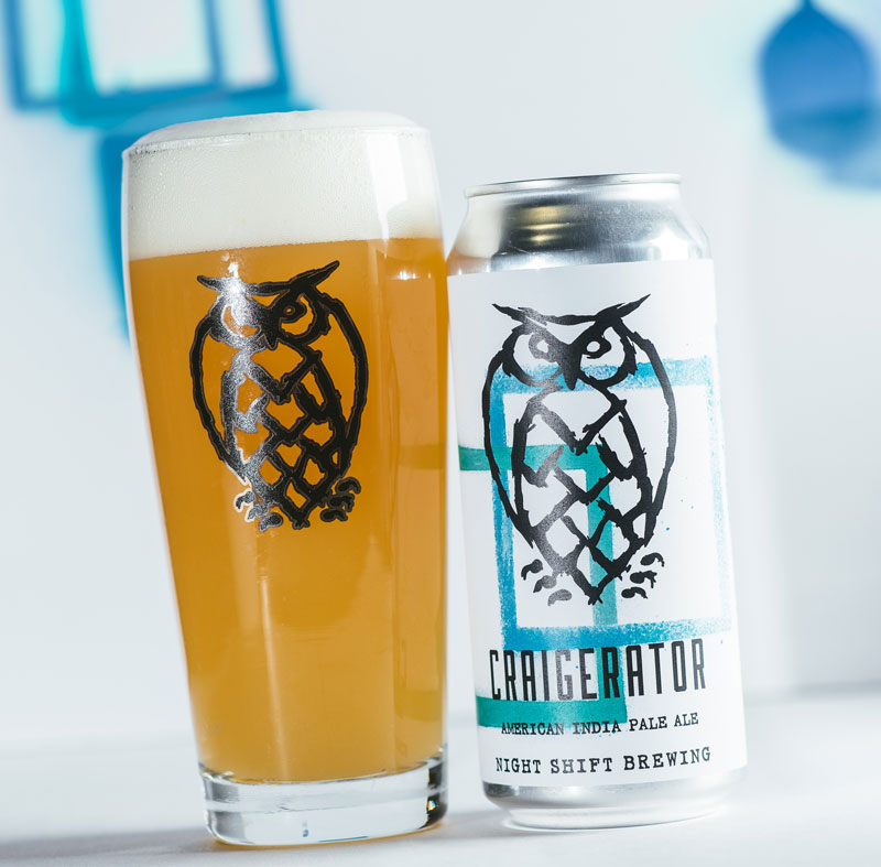
Craigerator
One of Night Shift’s brewers, Craig, inspired the design for the American IPA, Craigerator. Tim and Craig had spent a long time talking until they got on the subject of graffiti art. This was something Craig was really into and that lead to the inspiration behind the can. Tim purchased a few cans of spray paint and went outside on a really windy day. The result can be seen on the can today.
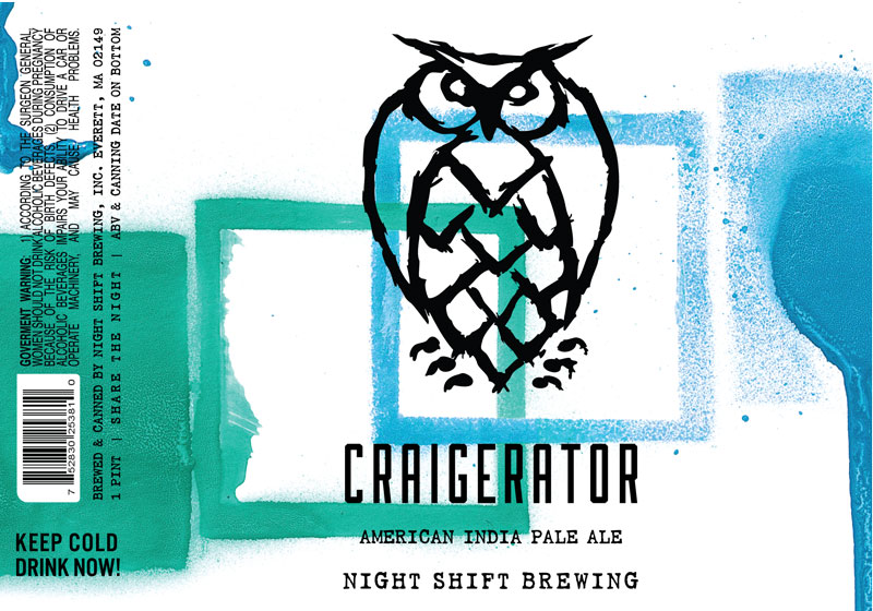
“We arrived at a design we never would have been able to get to if we had hired an outside agency to do it for us.” Tim said. He went on to explain that it’s not about the beer but the people who make the beer and in this case the brewer. This is how each can has its own unique fingerprint.
A Community that reflects the Practice
Experimentation and discovery also carry through to the visitors of the taproom and the community in general. “Our best sellers at the taproom are flights.” Michael shared “When people come, they are looking to try new beers and share with their friends.” All different kinds of people visit to try the new flavors that the brewery has created.
“This is something that speaks to the energy of the company we try to encourage, no idea is too ridiculous, nothing is done so well that it can’t be done better,” Michael said. Whether it’s brewing or design.
When we finished the interview I asked the brothers what is something that they want people to know about Night Shift that they might not already know. Michael shared that people sometimes use the old logo by mistake even though its been updated. If you look below you can spot the differences.
Check out Night Shift at there website, on Facebook and Instagram so see the latest new beer they’re adding to the family.

Michael Oxton
Tim Oxton