Luke is a multi-disciplinary Designer & Director from Manchester, UK. His process involves fusing design, technology and brand to create captivating and thoughtful experiences across multiple platforms – digital, analogue and environmental.
Over the past 10 years, Luke has worked both as a freelancer and a full-time Art Director / Designer for agencies such as TBWA, Firstborn, Saatchi & Saatchi and Method, creating coherent experiences for brands such as Pepsi, Playstation, Google, Ford and AT&T.
I recently caught up with Luke Finch, the art director and genius behind the DxB People First branding. We conducted the interview via multiple email chains and chats, and were also able to do a face-to-face at the event in September. He was heavily involved with the conference remotely, so I was excited that he decided to fly out and see his work fully realized. But more on that later.
As you know, our theme this year is People First. What does People First mean to you?
It’s a theme that plays a massive role in my workflow. Someone once said, “Don’t make something unless it’s both necessary and useful. But if it is both necessary and useful, don’t hesitate to make it beautiful”.
We have received a lot of good feedback and buy-in from people regarding our theme for this year. Why do you think People First has resonated with so many people across so many different design disciplines?
It’s one of the most fundamental rules to a great experience—being able to design something that connects with the user, understands them, and is empathetic to their needs is key. I don’t think it matters if you’re a designer or not, if you’ve failed to create a good experience, the chances are it won’t succeed.
We are really interested to hear about your creative process; either in general or for your DxB work. Do you have a specific process that you use while going through each project you take on?
There is no perfect answer for this because my process varies depending on the type of project. The best way I can describe my approach in general is probably “Systematic”.
DxB gave me a specific theme (#PeopleFirst) and the rationale behind it. Along with that came a bunch of brand principles and a style-guide, which later became less important as the creative process evolved.
The first thing I did was create some experience principles to help define the core attributes specifically to the theme. This helped me create a framework to keep referring back to. This is especially helpful as new suggestions come through and provide the argument as to why we should or shouldn’t do something.
I then created some word association spidergrams of things connected to #PeopleFirst. I distilled the list into 5 concepts and sketched out a few visual expressions that could compliment them. There were a few rounds of sketching and presenting to the team before we all agreed on one path—this is typical of any project really.
Here are a few of those early, proposed sketches.
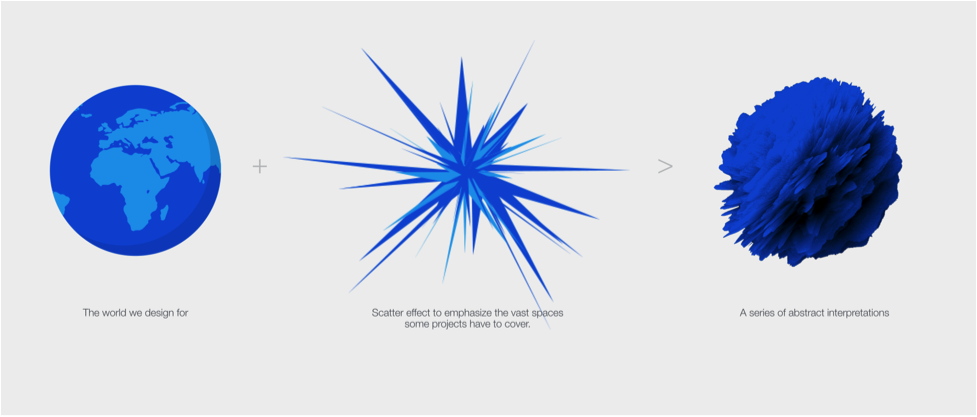
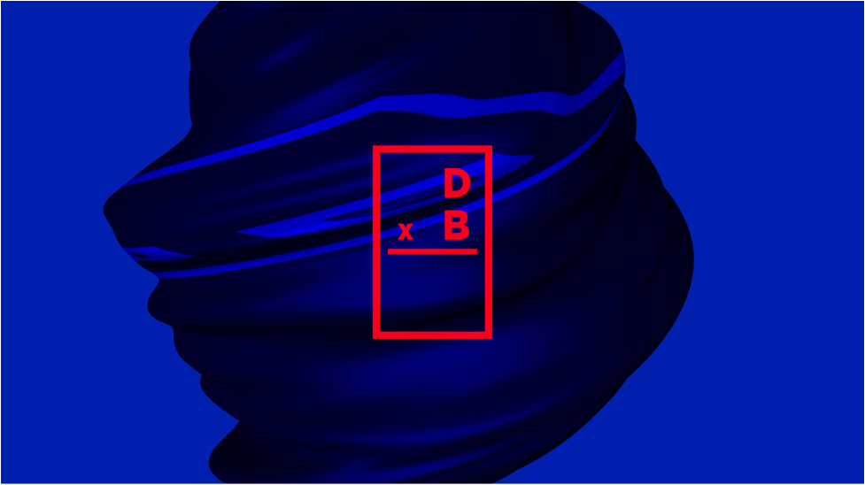
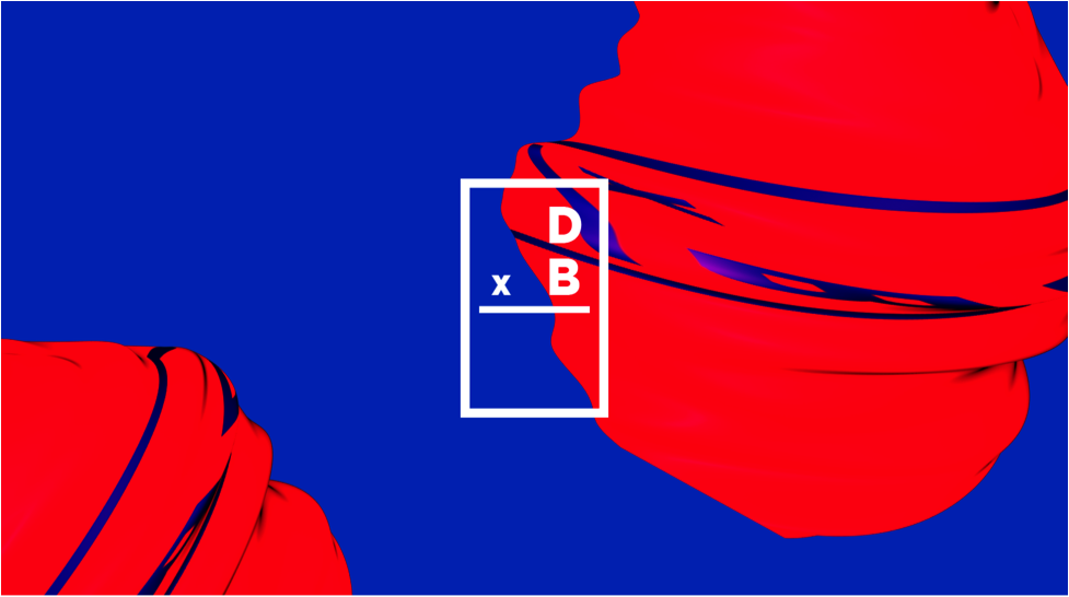
Round 1 / Concept 1 – Organic & Vast Spaces

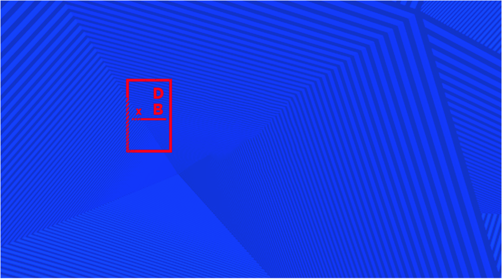
Round 1 / Concept 2 – Perspectives
Round 2 / Concept 1 – Chromosomes
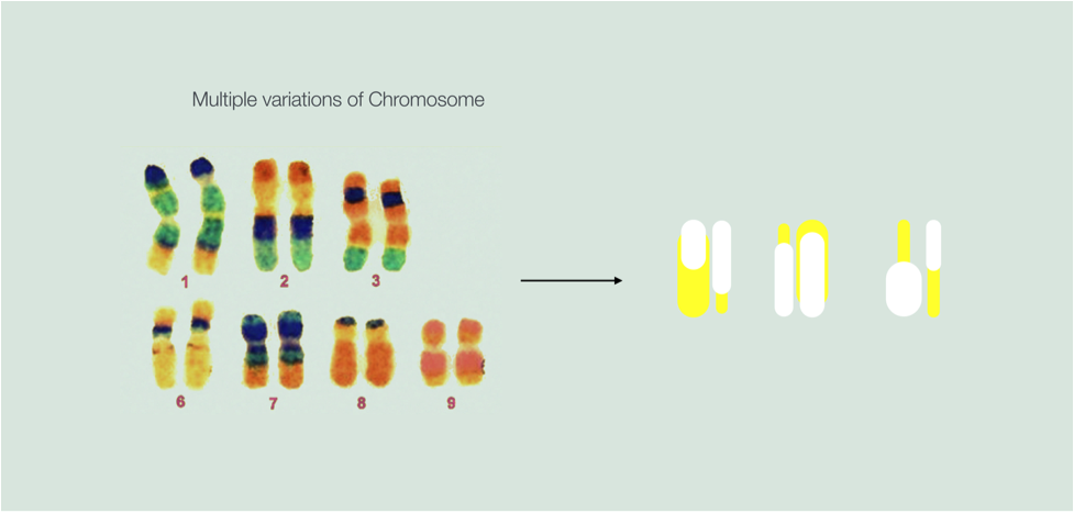
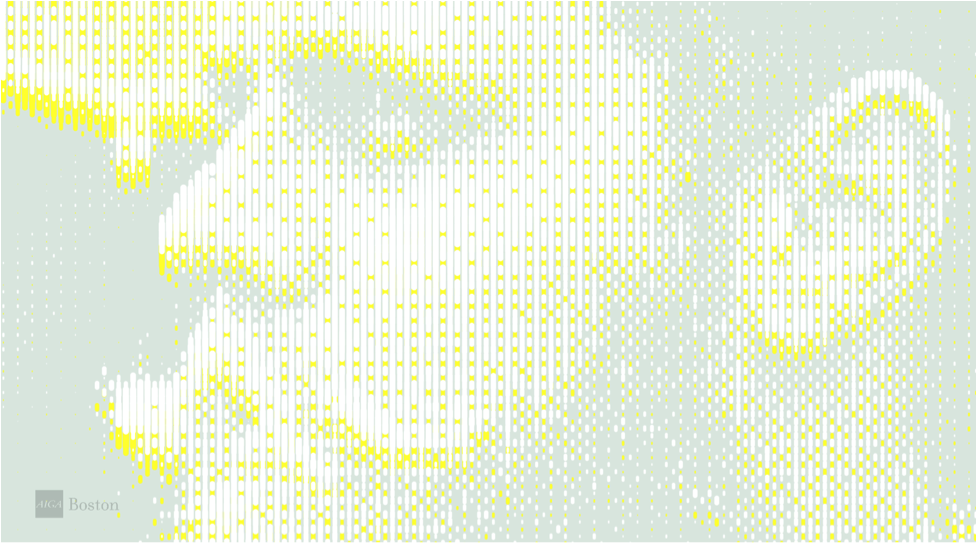
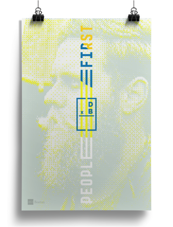
Round 3 – Concept: Chromosomes
At this point the concept was chosen but color and typography was still something the team felt unsure about, so I did some explorations.
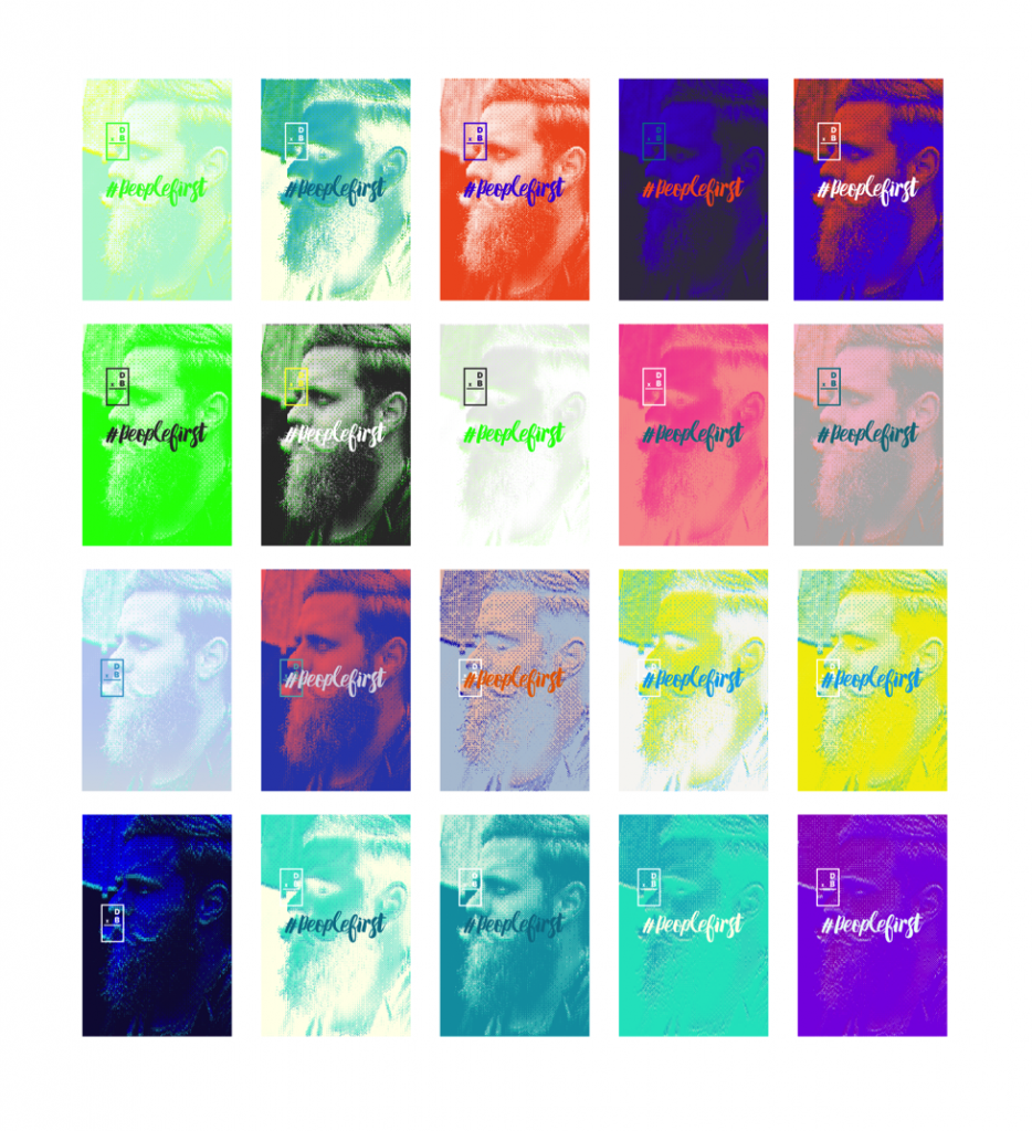
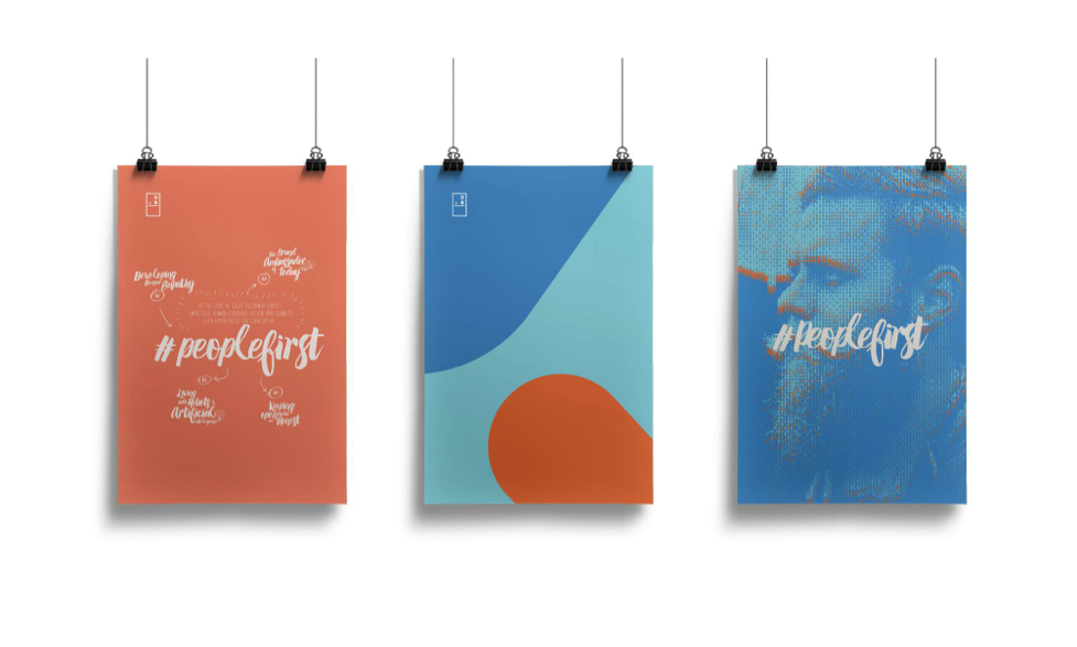
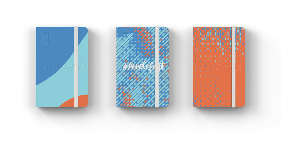
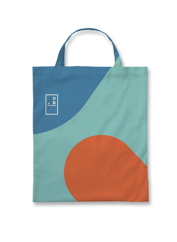
Finally we settled on this direction in Round 4.
Finally, if you could give one piece of advice to graphic designers still trying to find their voice, what would it be?
Never stop learning and always do side projects…you’ll gain so much invaluable experience by doing these 2 things hand in hand, and you’ll ultimately refine your skills as a designer and problem solver. It’s also a great way to explore some of those subjects that you’re interested in but you’re full-time job doesn’t give you the opportunity to do. Even though most of my personal projects never saw the light of day, everything I did led me to where I am today. So no time was ever deemed worthless. I think as long as you’re forever trying to better yourself, you will always produce better work.
Want to know more about Luke? Here’s the full interview:
You’re from the UK, so can you share a little about how you found design and how design got you to the United States?
I would love to be able to say I always knew I wanted to be a designer, but the truth is I just fell into it. I loved graphic design in school and remember as a kid designing pointless things on my PC using Microsoft Publisher. I laugh about it now because maybe I was destined to actually do design. I’d always dismissed it as a career, maybe because I didn’t think it would take me very far.
In 2001, I went to university to study business as a way to kill three years until I figured out what I really wanted to do. It was a mind-numbing course and didn’t take long for me to realize it wasn’t for me. At the same time, most of my friends were doing Multimedia Design and I would get jealous of their projects as well as the fact that they were learning how to make their ideas come to life using Flash and Photoshop. So I dropped out of Business Studies and enrolled into Multimedia Design.
When I graduated, I set up WeLoveNoise and freelanced for a while in order to build up a decent portfolio. This evidently landed me my first real job as a Junior Designer. Shortly thereafter, the company I was working for got bought out by the Saatchi & Saatchi giant. I worked my way up through the ranks for a couple of years and left to go back to a small studio. I wasn’t at the new job for long because I felt really complacent with the work and the fact that I wasn’t learning. So in 2011, I ended up getting a job as an Art Director with an agency in New York called Firstborn (this was Luke’s ticket to the US). It was a great personal achievement because Firstborn was a studio I had always looked up to and they were renowned for great work.
I was in New York for a year working alongside some insanely talented designers on great projects for big clients like Sony and Pepsi. My time there was invaluable, the experience and skills I gained really elevated me as a designer and a person. However, I realized that I didn’t want to do advertising anymore. I wanted to design brands, systems, and products, not campaigns that would last three months on the web.
I returned to the UK in 2012 to pursue freelance opportunities. I focused solely on brand and digital product design for studios in both the UK and US. I think no matter what discipline of design you are doing, the industry can be a stressful place. When you merge that with being a workaholic and being an OCD perfectionist, you can crash and burn – which is exactly what happened.
So in 2013 I made two decisions:
1. Attempt to change careers and do something less stressful.
2. Launch a website that would serve as a legacy of my best work, something that I could look back on.
Don’t get me wrong, I still loved design, I just wanted to do my own projects. So when I launched the new portfolio of work, I was overwhelmed by the response it received. This directly led me to give the design industry another chance. It’s always nice to hear when people appreciate your work and those events really reignited my determination to become a better designer and succeed in the industry.
The work and website gained a lot of recognition with features in articles, books, and awards, but the best thing that came out of it was the doors it opened. I was having great opportunities thrown at me. This is where Method in San Francisco comes into play. Method was a studio I had always admired, and had felt like we shared a similar design mentality. Most importantly, I knew that they would help me grow as a designer because of the talented people working there. This sort of experience is priceless, so I accepted an offer and I’ve been working there ever since.
Your life can’t be all work and no play (some would beg to differ), so what do you do when you’re not ‘on the clock’?
I would beg to differ…I’m kind of obsessed with work. I’m amazed I’ve had a wife who’s put up with my shit for 13 years! But when I’m not working, I’m usually socializing with friends, exploring new places and watching movies. I’ve also been doing a lot of fencing recently which is awesome (the sword fighting sport, not making garden fences).
I also try to take my New Year’s resolutions seriously. So this year I decided to do something new everyday, which is going very well. I’ve done a lot of things I wouldn’t have normally considered—such as eating new foods like bacon flavored chocolate (which was a terrible idea). I’ve also been more proactive like visiting new cities and even experiencing things like going to the ballet.
How did you become familiar with DxB and what prompted you to want to help out?
I stumbled across a cool design competition back in 2013 that Jason Stevens (Producer of DxB) had set up called “The Say Something Poster Project”. I had wanted to submit something, but the problem was I had missed the deadline by a year. So Jason got in touch explaining the situation and asked whether I’d be interested in getting involved in the Design Exchange Boston event he’d just set up. I was definitely open to the idea, but at the time I had just moved to San Francisco (from the UK) for a new job. I couldn’t really commit to anything until I was completely settled.
A year later, I received a random email from Jason asking if I would be interested in getting involved in year two of DxB. The timing was perfect and I loved the theme of #PeopleFirst. We started a conversation around how I could get involved and then formed a plan of action for deliverables. I was a really excited and knew this was a great opportunity for me to play a big role in dictating how this year’s event would look and feel.
So you became the Creative Director for DxB2015. What was your experience like? What have you worked on?
The core DxB team was small and although we had volunteers come and go throughout the process, I think my role on DxB2015 surpassed just doing creative & art direction. It involved me being more hands-on, in terms of production work, to help make the concept a reality. Over the course of the year, I worked on a multitude of different things from branding, to apparel, and even tackled a bit of coding (which surprised me because I thought I’d forgotten most of my HTML/CSS knowledge).
I learned a lot throughout this project, but then again, I always learn new things on every project. I learned a lot from a management perspective, as I’ve never really had to deal with trying to execute a visual concept alongside a team of volunteers who are all working remotely. It was tough, especially when we all had full-time jobs too.