The craft beer movement was born in Boston. From Boston Beer Company to Harpoon there are dozens, if not hundreds, of breweries across the state. You might have noticed in the aisles of your local grocery store-how amazing the packaging from craft beer has gotten. At AIGA Boston we LOVE craft beer. We wanted to know what that process is like from the liquid design of Mystic Brewery to the experiments going on at Nightshift, what makes good beer packaging? No two breweries are the same and we got to explore what makes a few Massachusetts breweries tick.
Carly Hagins of Toast Studio is a beer lover. “For as long as I’ve been a drinker, I’ve been a beer drinker,” she told me. Her passion for craft beer and the community that comes along with it shows in the work she’s done for Harpoon and more recently with Castle Island Brewing. Carly is an industrial designer by training and she uses those skills to help design projects to scale.
Designing Big
When Carly first started freelancing she also picked up a job as a bartender and a tour guide for Harpoon Brewery. When Harpoon had a position open for an in-house designer Carly jumped at the chance. Harpoon is one of the biggest breweries in Massachusetts. And Carly explained how they lead the industry in some ways. Early on, Harpoon created an in-house team of designers that are able to work closely with the rest of the sales and marketing team to create the perfect visual for beer. Having a nimble design team helps Harpoon explore and experiment with their brand. “I was able to really cut my teeth and learn what it takes to design for beer.” said Carly.
At Harpoon Carly could see what big breweries could do design-wise. She created marketing pieces and did the photography for them during her time there.
Castle Island looks to design early
After working at Harpoon, Carly went back to freelancing and found work with Castle Island Brewing Company. Carly cleaned up the original label design–and more importantly helped Castle Island develop a design system that could scale as fast as they are scaling.
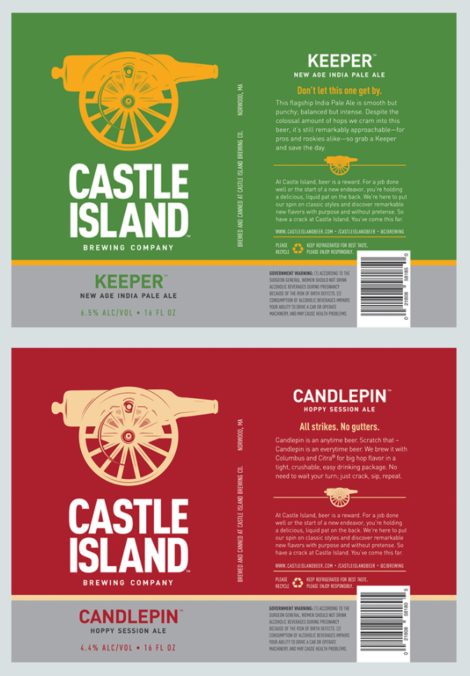
Castle Island Brewing Company Label, from Carly’s Behance
Castle Island hired Carly right as they were starting which helped set the stage for their brand. Carly explained that it’s such a crowded market, and bringing on a designer really helps differentiate the brand. Carly created a packaging system where Castle Island could pick a name and color and be ready for when their next beer was ready for canning.
“Castle Island makes beer that you would bring to a party or drink with friends.” Carly explained “It’s not beer that you stow away in your basement for safe keeping” Carly said as she explained what makes Castle Island different. The two founders of Castle Island, Adam Romanow and Matt DeLuca, are really passionate about beer, Boston and New England as a whole and their team and dedication reflect that: Good quality beer that is unpretentious.
They Grow Up so Fast
Being an industrial designer by training, Carly brought in her expertise to consider not just the visual design, but how it was going to be produced. One thing to keep in mind about craft beer production is that a brewery can only print on a can if the run is for 100,000 cans. That’s 25,000 four-packs of beer! It’s a lot of beer for a brewery who may just be getting started. Smaller runs of beer require labels on plain aluminum cans.
Carly understood how to design the most efficiently for the kind of beer runs that Castle Island wanted to do. Even now most of the cans have labels that wrap around the cans, but the mainstays, Candlepin, Keeper, and Hi Def are printed on the cans rather than on labels, thought the very first runs were on labels.
The beer industry moves pretty fast. It doesn’t take long for beer recipe ideas to become reality in a matter of weeks. As a matter of fact, The cans are created two weeks before a beer is launched. “A beer recipe is developed and tested. Once it’s brewed on a production scale, we get into packaging. The whole team works on a name and founder Adam works on the copy for the back of the can. Once those things are figured out, they get sent to me. I put everything together with a few color variations, they choose their favorite, and it gets sent to the printer. The printer typically ships labels just in time for the beer to be packaged.” explained Carly.
Castle Island’s design system helps keep a consistent look while also keeping up with production. A quick peek at their website shows how many beers they produce.
Castle Island itself is a pretty young brewery. They only opened to the public in December of 2015 and since then, they have produced twenty-eight different kinds of beer.
Creative Juice
This system of plug and play design helped create some creative bandwidth for more involved beer projects. As the brewery expands so can the brand. Castle Island’s Chuck is a great example. This beer was created as part of HUBWeek in collaboration with the Charles River Conservancy and brewed with water from the Charles River. The can still follows the system of the other cans but it offers an illustration and more artful approach to their beer. These days Chuck is brewed with regular water but still maintains the same style.
For the Love of Beer
Scaling for Castle Island means connecting with people who love good beer. Carly said her favorite part of designing for craft beer is everything. There is a camaraderie that Castle Island captures in their brand. Whether it’s between friends at a party, or different breweries sharing a love for their craft, Castle Island is there with the good stuff.
Happy birthday to Castle Island who turns two this month! Visit their website for more information on what’s going on. You can also follow Carly on Behance, and Instagram.