AIGA hosted web designer Ethan Marcotte to discuss Modular Patterns for Responsive Design. Ethan Marcotte coined the term Responsive Web Design and has published multiple books on the subject. Responsive Web Design uses reusable design templates, or patterns, and pieces them together to create larger, adaptable layouts. With the ever-undulating waves of new devices hitting the market, designers need to exercise a different form of control in their designs. Designers must look past the screen size and focus on a wider range of conditions that influence a design’s effectiveness. Ethan also discussed the usefulness of style guides and how to create and organize them.

Photos by Amanda Bakerlee
What’s the Forecast?
Ethan opened up the discussion by stating, “If I was going to sum up most of the conversations I’ve had about the state of responsive design…I think you could boil many of those questions down into one simple sounding question- ‘Where are we going?”
In the tech area, there’s been a lot of change in a short period of time. There are an estimated 8 billion mobile devices being used all over the world today and that market is still growing. In 2011 alone, around 80 new tablets have come to market. Designers need to plan for the kind of devices they’ll be designing for in the future, even if we don’t know what those devices will be capable of yet. Designers can prepare for this ambiguity by making a switch to more modular patterns.
Creating Modular Patterns
Traditionally, designers would open a blank canvas in InDesign or Illustrator, create a grid, and fill that grid with content. The content would be added from the frame’s edge and move inwards. Now, as the web gets more complex, designs need to be more modular and pattern driven.
Instead of one box filled with content, many small boxes are made and laced together to create a design pattern. The design pattern is like a tapestry – each piece can be reused and combined with other individual patterns to create an entirely flexible web page that can be rearranged based on different conditions.
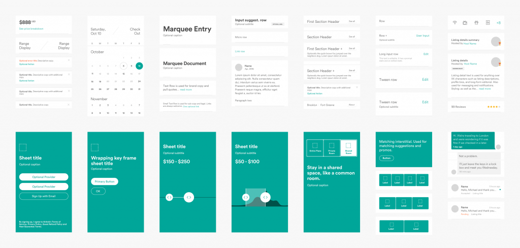
Airbnb’s Design Language System
Design for Non-Ideal Conditions, Not by Device
“Supporting a browser doesn’t mean every single browser or device gets the exact same experience.” Ethan stressed. There are many variables to consider that are independent of screen size. Around 60% of the world’s data connections are sub 3G. What if someone is using their mobile device with a great Wi-Fi connection? Or someone is using a high-resolution desktop screen with a terrible Wi-Fi connection?
Ethan said, “Most of the way that I talk about responsive designs with my clients are in very idealized terms and they shroud a lot of this complexity that we actually have to think about.” The truth is that most of the time, a web page will be viewed in non-ideal conditions.
Responsive designs should always be device-agnostic: taking into account variables such as screen resolution, browser capability and connection speed. The web design can have a baseline layout that’s viewable by any web-connected device. It can then build and become more complex for more capable browsers.
The Importance of Style Guides
In order to document responsive designs and look at them all in one place, style guides or pattern libraries are useful. Ethan said, “From an organizational standpoint [a style guide] helps bridge what some companies have called a collaboration gap.” Designers can quickly pull patterns from the library to look at side by side with the engineering team or quickly get a new-hire on board. There is a three-step process to creating a style guide. It first begins with a visual inventory where all the patterns are cataloged. Then the patterns are named and organized. Finally, the patterns are translated into HTML and CSS.
Creating a Common Language
The most difficult stage of creating the style guide is the naming and organizing of the patterns. Issues that arise include how to make modules distinct from one another or how to avoid duplications from multiple teams contributing at once. Ethan said, “Its naming and language around our design patterns that helps create a shared understanding around how these patterns will be put to use.”
Teams need to create a shared common language around design patterns. The language can also include principles that tie back into the organization’s values. For instance, the Vox Media team vets new designs based on their five design principles: uniqueness, reusability, clarity, responsiveness, and accessibility. Airbnb uses its design principles: unified, universal, iconic, and conversational to build web designs that mirror the company’s core personality.
With a deep understanding of the core language and principles of the organization, come more diverse and effective designs.
As the atmosphere for web design evolves, new markets arise and others die without much time to forecast. By developing modular patterns, updated style guides, and a common language with our teams, we can quickly morph our designs to be in line with the present.
Amanda Lenkauskas is a Boston-based freelance writer. When she’s not busy writing about the world around her, she can usually be found reading, planning dream vacations, or scouting out dessert. Learn more about Amanda on her LinkedIn.
