Michael Russem is the curator of the Katherine Small Gallery. The gallery is dedicated to exhibits about graphic design and has a small offering of books about the same.
It’s not difficult to find examples of Ivan Chermayeff’s book covers. They’ve been featured in monographs about his long and legendary partnership with Tom Geismar, magazine profiles of their firm, and surveys of book cover design; they’ve been selected for inclusion in numerous AIGA competitions. Ivan’s best covers share qualities with his celebrated logos, posters, advertisements, and collages: they’re charming, clever, witty, and fun. Although it may not be difficult to find examples of Ivan’s covers, when they’re shown with other examples of his work it’s easy to overlook them. Displayed alongside his firm’s intimately familiar logos for Mobil, Showtime, MoMA, and Chase, they tend to get lost. We’re inclined to notice and remember what we already know, and miss what’s less familiar to us: when in a crowd we seek out faces we recognize, the rest we barely register. Who knows how many times I had come across the best examples of Ivan’s covers before I finally understood that book design was once part of his daily work.

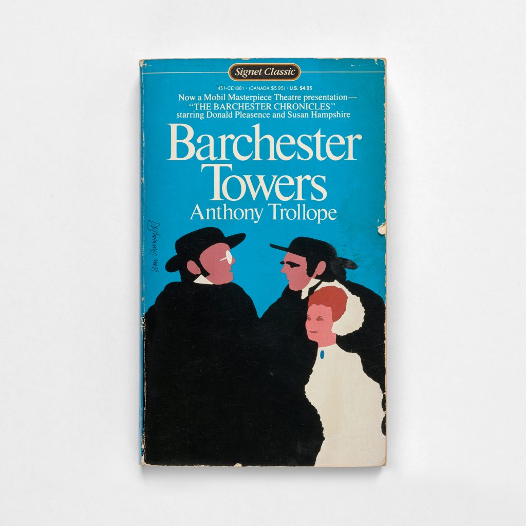
An illustration created by Ivan Chermayeff likely typeset by another designer
Not long ago I came across a box of free books on the street. The pickings were slim, but I was struck by the graphic efficiency of the illustration on a cover for Anthony Trollope’s Barchester Towers. And then I noticed Ivan’s signature. And then I considered the entirely forgettable typography. Did Ivan really design this? Probably not. It’s likely that his illustration for the related poster was simply dropped in and the type arranged by someone else. But it finally occurred to me that designing book covers was something Ivan did somewhat regularly. It wasn’t the best of his work that finally grabbed my attention. It was the least interesting.

The typographic treatment of Chermayeff’s covers often stood as a metaphor for the contents within each book
Some of Ivan’s covers are great. Others simply get the job done. When he reviewed the covers with me last spring, he seemed to draw a similar conclusion, dismissing one I happened to like by remarking that it was nothing special. Others he referred to as his bread and butter. One was so unremarkable that he couldn’t believe it was his work even though his name was right on it. But we agreed there were some definite winners, examples of what the best covers can be: clear and striking, intimate and enticing. This first exhibit at Katherine Small Gallery is an opportunity to focus on these exemplars (plus Barchester Towers) without being distracted by the iconic work for which he is so well known. This is our chance to concentrate on new faces in the crowd and gain insight into the remarkable career of Ivan Chermayeff.

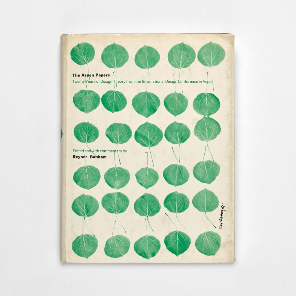
Chermayeff’s design for Aspen Papers
Since 1994 Michael Russem has been a book designer at the
Offices of Kat Ran Press in Somerville, Massachusetts, designing books, exhibition catalogues, posters, and ephemera for Harvard University Press, MIT, New York Review Books, David R. Godine, Pressed Wafer, Smith College, Vassar College, and the American Printing History Association (APHA). He is a former president of the Society of Printers and currently a trustee of APHA. Prior to opening the
Katherine Small Gallery, his primary distraction was collecting
postage stamps by type designers, AIGA Medalists, and notabale graphic designers.