The Poster. It sits contained amid the noise of our world; one thinker’s message delivered as their final say. The humble medium asks for little more than a glance for which it will exchange an idea. Sharing messages that words alone cannot say, and that images alone cannot express, the poster is a designer’s truest challenge.
Constraints force creativity. The poster’s simple format provides boundary, while politics, censorship, capitalism, society, and freedom provide context and force reaction. Throughout time, the poster has been everyman’s means of expression. Thus, we took a moment to reflect on the strength of a single piece of paper.
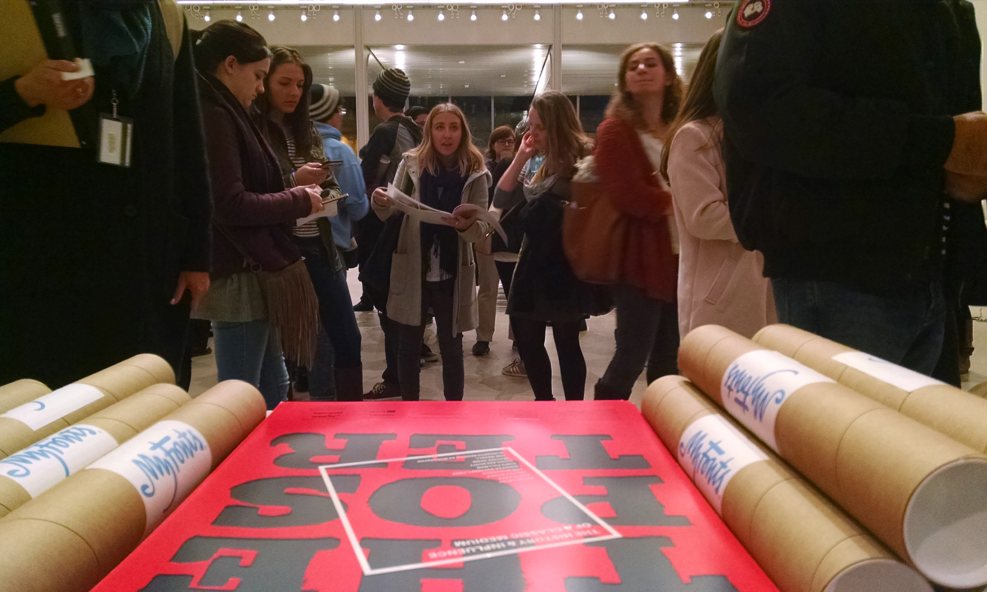
MassArt’s Design and Media Center buzzed with conversation as students and seasoned designers alike waited to enter the room where the presentation was taking place. Before 6:30 PM the mass stretched well into the middle of the main lobby and it was not long after doors opened to the lecture hall that it was standing room only for the talk.
Elizabeth Resnick, professor at MassArt, AIGA Fellow and curator of Women’s Rights are Human Rights poster exhibit introduced our speakers: Douglass Scott, Jennifer Roycroft Pires, Allen Haley, Heather Shaw, Tom Wedell, Andrea Marks, Ann McDonald and Chris Pullman. The speakers shared themes of culture, influence and metaphor during their six minute and 20-second talks.
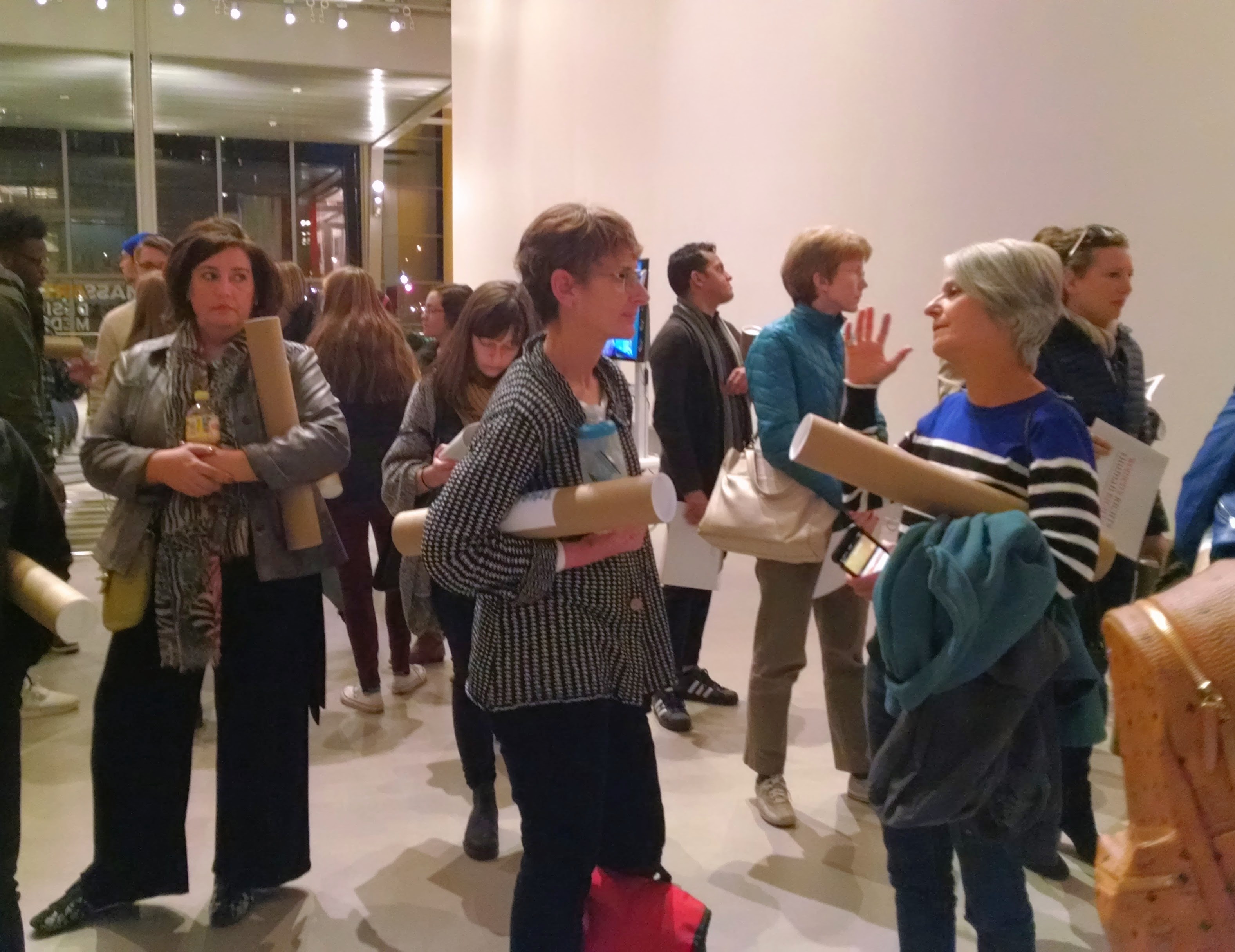
Guests gather in the lobby of the Design and Media Center before the talk
Posters as Reflections of Culture
All of the speakers touched on the poster’s role in shaping culture. Jennifer Roycroft Pires walked through United States history through the art of poster design. She highlighted the stark contrast between ads for events, luxury items, or tourism and wartime propaganda. The differences in style and content showed the shifts in economic priorities in the early 1900s.
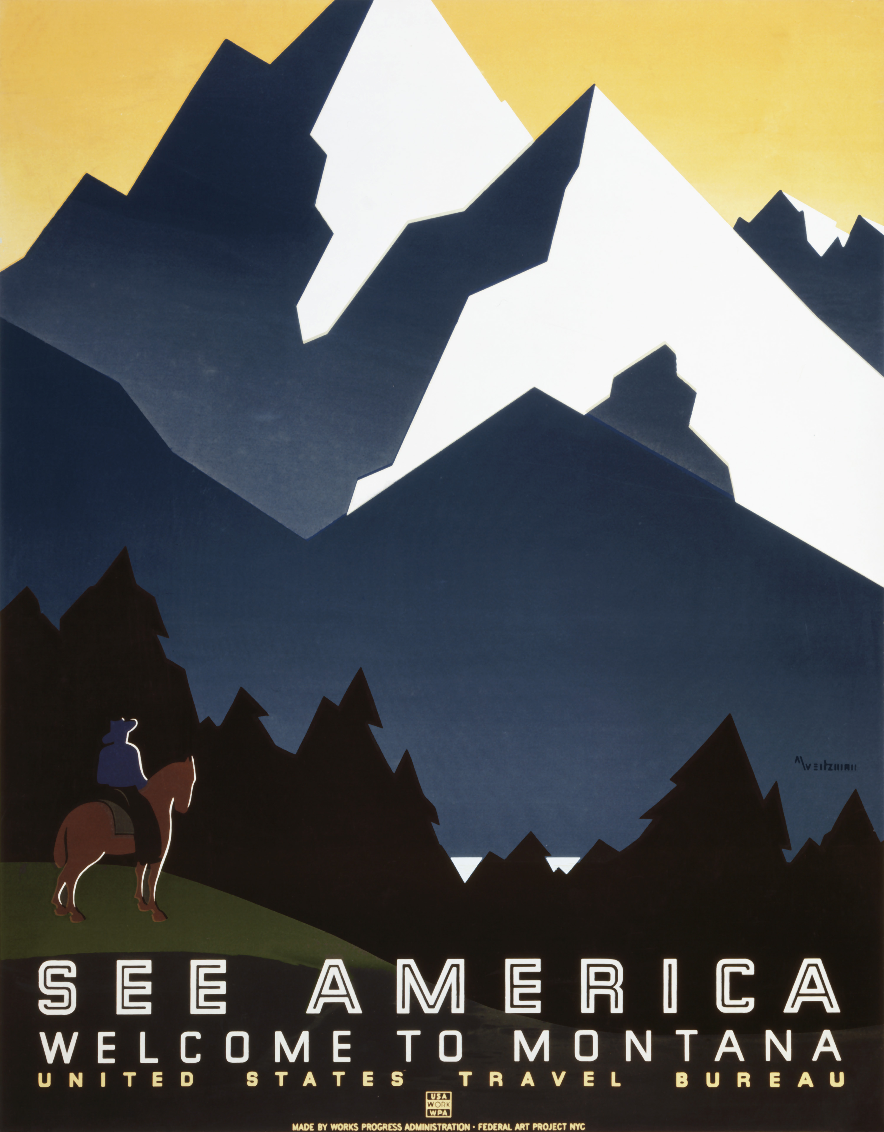
See America, Welcome to Montana, 1936-9
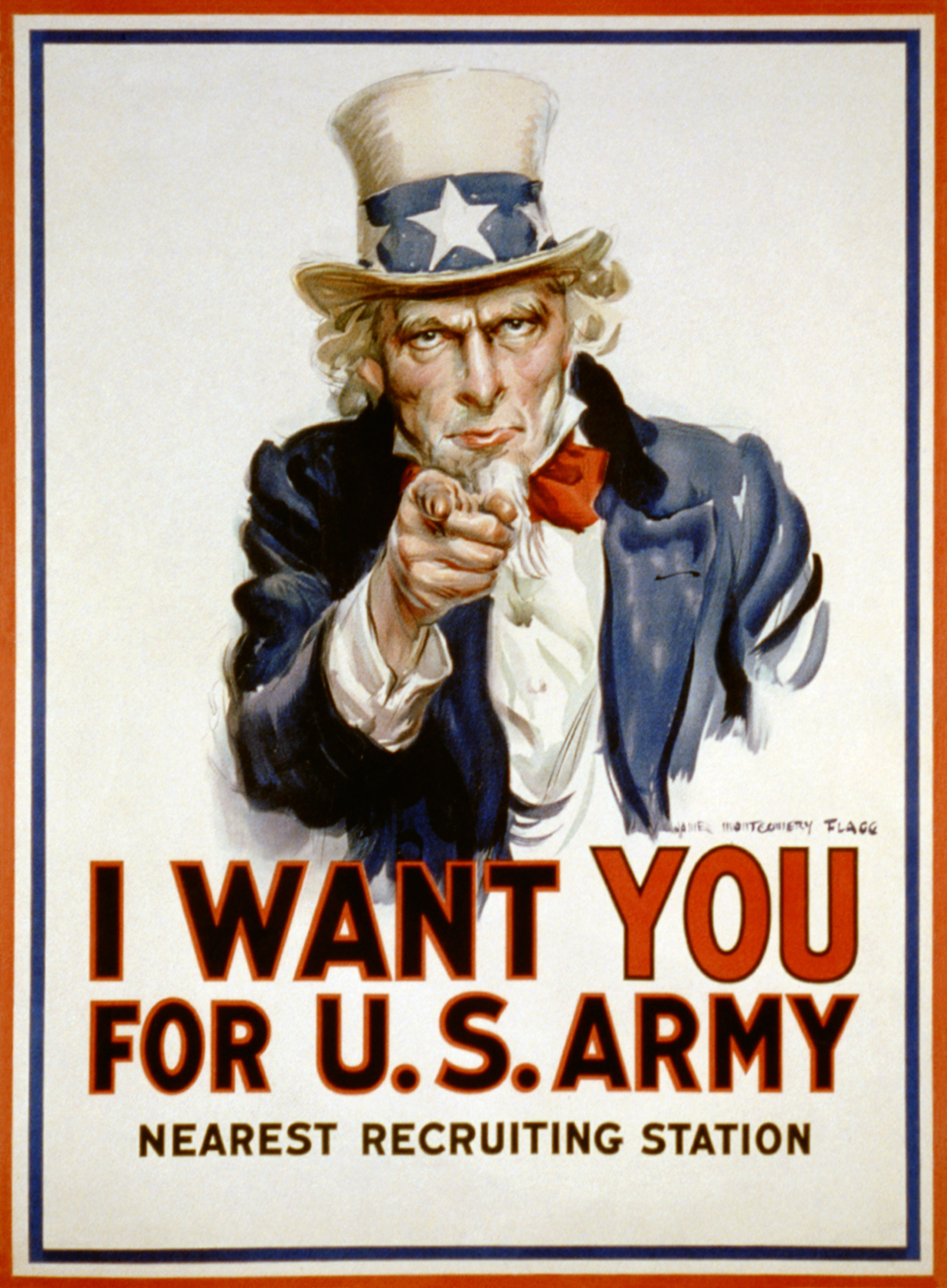
I Want YOU, 1917
This attention to detail was not limited to America. Three speakers dove into the nuances of culture seen in poster design internationally.
Heather Shaw revealed the history of Hindi Cinema through its movie posters. The film industry in India flourished in the 1950s and these films explored socio-economic struggles in India. Many films centered around the caste system and the conflicts of virtue and sacrifice. Each poster was beautifully crafted and conveyed the expressive nature of each film.
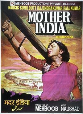
Mother India, 1957
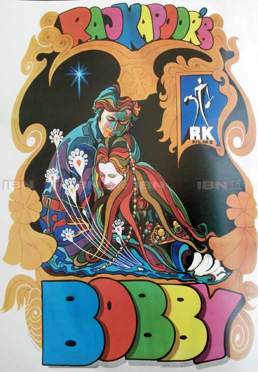
Bobby 1973
Next, Tom Wedell shared movie poster design in 1920s Russia. The Stenberg brothers were the focal point to his talk. These two engineers, who originally created sets for theater productions, influenced the visual style that would define Russian Constructivism. Their posters were experimental, and the two used their understanding of spatial relationships to create dynamic compositions. Each poster in Wedell’s talk was more expressive than the last. The designers understood the theories that motivated directors, and therefore were able to convey the right tone in their graphics.
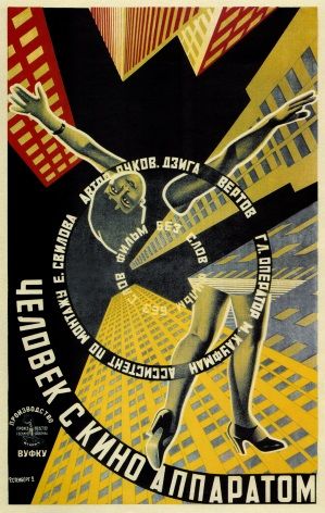
Man with a Movie Camera, 1929
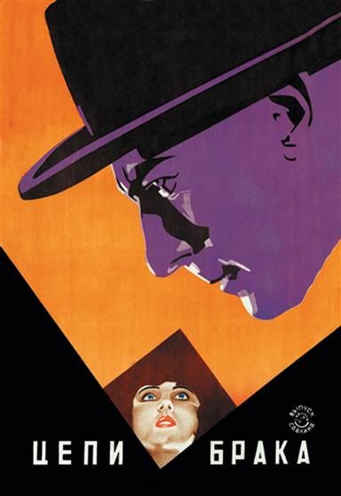
The Burden of Marriage, 1924
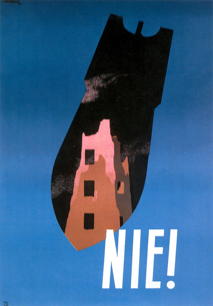
Andrea Marks then took us on a journey to the streets of communist Poland in the years following World War II—an unexpected place for creativity to flourish. Posters decorated fences that contained the debris from conflict. In Poland, each artist had their own unique style. Designers wove politics and culture into the message of the posters, with the goal of getting it past the Communist censorship board. Ironically, when communism fell and capitalism took its place, Polish artists had less creative freedom. The distinct styles of each artist became lost to the homogeneous visuals of western brands.

Nie!, 1952
Each presenter spoke with great care about how posters reflected and shaped their respective cultures. What was striking was not cultural differences or language barriers, it was that most of the concepts and themes explored were universal. Designers explored how type could wrap with image to convey meaning without needing to spell it out. The rendering of images—whether high fidelity portraits or abstracted forms—spoke loud and clear about the struggles, hopes and dreams of the citizens.
Posters as Powerful Influencers
A poster only needs a brief moment of one’s time in order to communicate. Perhaps that is why this medium has always been pivotal in both capturing and influencing the beliefs and visual language surrounding it.
Ann McDonald showed how visual commentary erupted through poster design in her presentation titled “Posters (or Memes) as Seeds of Participation.” This can be seen as early as the 1917 in Uncle Sam posters promoting U.S. recruitment for World War I. The original concept came from Britain’s Lord Kitchener Wants You (1914). Even today, the famous pose and phrase “I want YOU” remains a constant visual device for the state of politics. McDonald pointed out how the poster has shifted since the advent of the internet. She explained that memes have become the new response to posters, using Keep Calm and Carry On as an example. The poster was designed by the British Ministry of Information in 1939 but wasn’t released until recently. As Keep Calm and Carry On became a sort of inside joke on the internet, it lost its original meaning to pop culture references and pieces of advice. However, in some instances of the parody the poster takes on new political meaning. Keep Calm and Carry On resurfaced in England during the Occupy London Movement and, most recently, with Brexit, marking the modern day ideology.
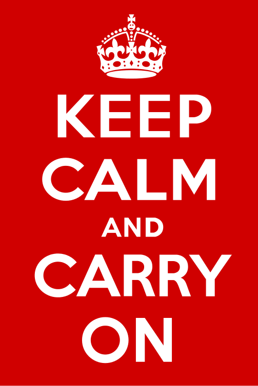
Keep Calm and Carry On, 1939
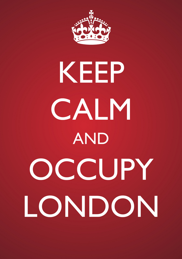
Keep Calm and Occupy London, 2011
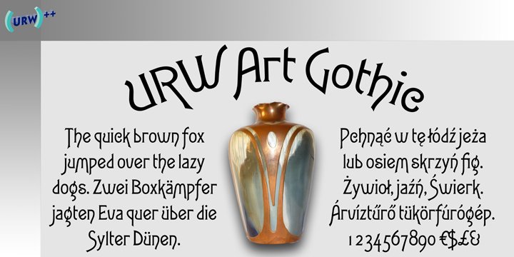
Speaker Allen Haley described the poster as the “bellwether of typeface design.” He outlined the defining characteristics of art movements such as the Art Nouveau, Bauhaus movement, and Art Deco as well as the periods that shaped our history such as the Industrial Revolution, the War Years, Psychedelic and Grunge. Art deco advertisements for French motorcycles inspired typefaces such as Art Gothic and Auriol.
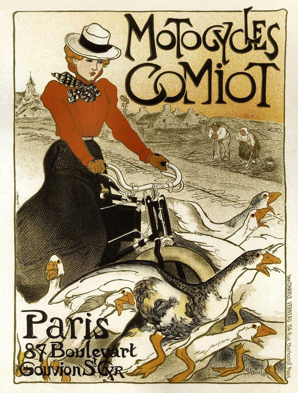
Motocycles Comiot
Posters that emerged from the Bauhaus movement inspired experimental, geometric typefaces such as Futura and Schwitters. Haley also explained the values of American wartime through typefaces like Brush Script and Trade Gothic, noting, “the government used handwriting in the posters to say, ‘we are spending money on the war not on fonts!” Each trend in poster design produced a collection of typefaces that mimicked the styles found in the posters.
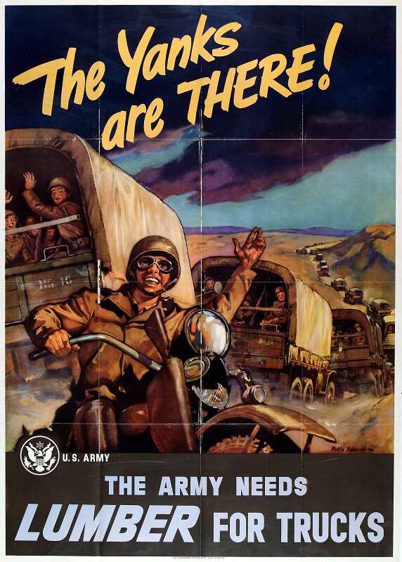
War War II Propaganda, Early 1940s
Brush Script, 1942
Posters as Visual Metaphors
The use of visual metaphor in poster design cuts across cultures and they influence everything from style to political agendas. Marks showed us the masterful use of the visual metaphor in the posters of post-war Poland. Movie posters such as Cabaret and Midnight Cowboy captured the moods, settings and subject matter of the films more articulately than their literal western counterparts.
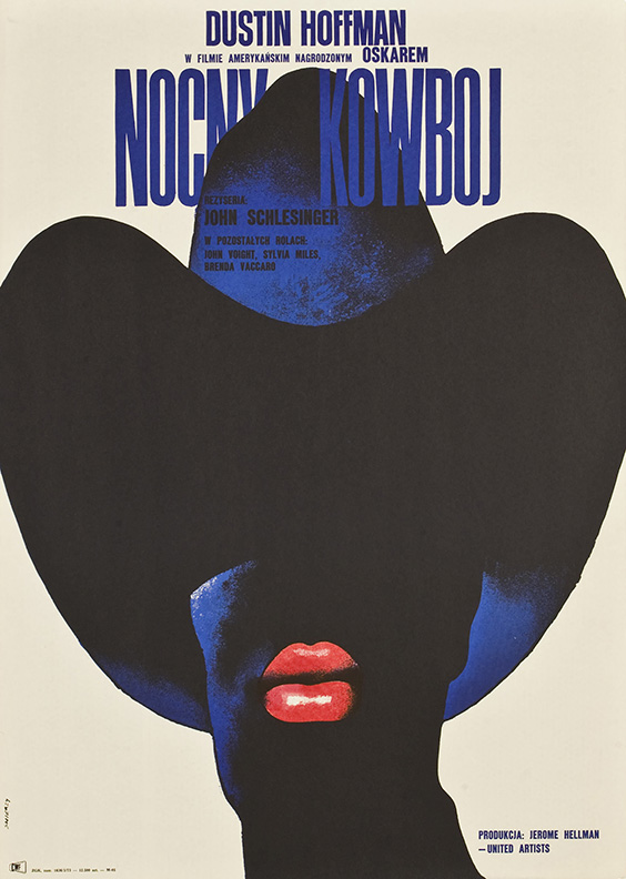
Midnight Cowboy (Polish), 1969
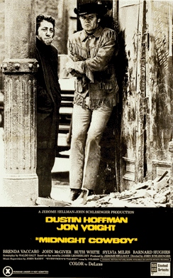
Midnight Cowboy (American), 1969
Chris Pullman, broke down these visual devices to reveal why the metaphor was so effective. Pullman highlighted five lessons to be learned in Swiss poster design, starting with Rene Magritte’s famous Treachery of Images. He explained how objects depicted in posters by Niklaus Stoecklin and Otto Baumberger are “realer than real.” They transcend the original object until the image becomes an icon.
Treachery of Images, 1928-9
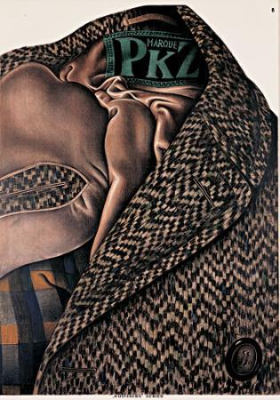
Poster of Tweed Jacket
Next came the surreal. He spoke of how a blend of different realities could create new meaning, pointing to designers like El Lissitzky and John Heartfield. Moving onto typographic devices, Pullman demonstrated how designer Ruedi Külling removed the object completely in favor of descriptive letter forms that alluded to it in his poster ad Bic advertisement for pens. Posters like Wilhelm Tell use typography as cornerstones of composition.
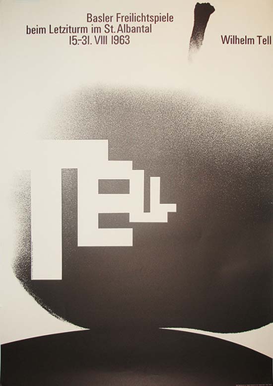
Wilhelm Tell, 1963
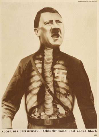
Adolf, the superman, swallows gold and spouts tin, 1932
Letterforms define the movement of the whole work and words which interacted with imagery created powerful compositions. Pullman finished with a fitting section on “formal disruption,” showing how works by Wolfgang Weingart dissect each element and reconstruct it to create a whole image greater than the sum of its parts. Swiss design provided a pragmatic way to handle type and image. If this traditional Swiss method was the analysis, then formal disruption was the synthesis of type and images in poster design.
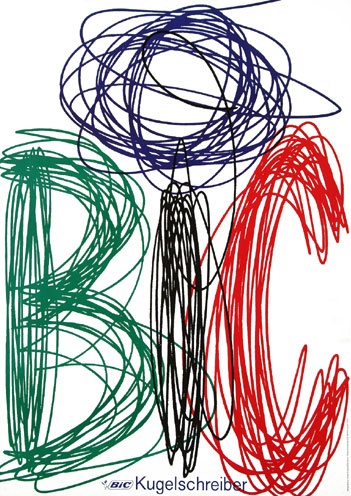
Bic Kugelschreiber, 1960
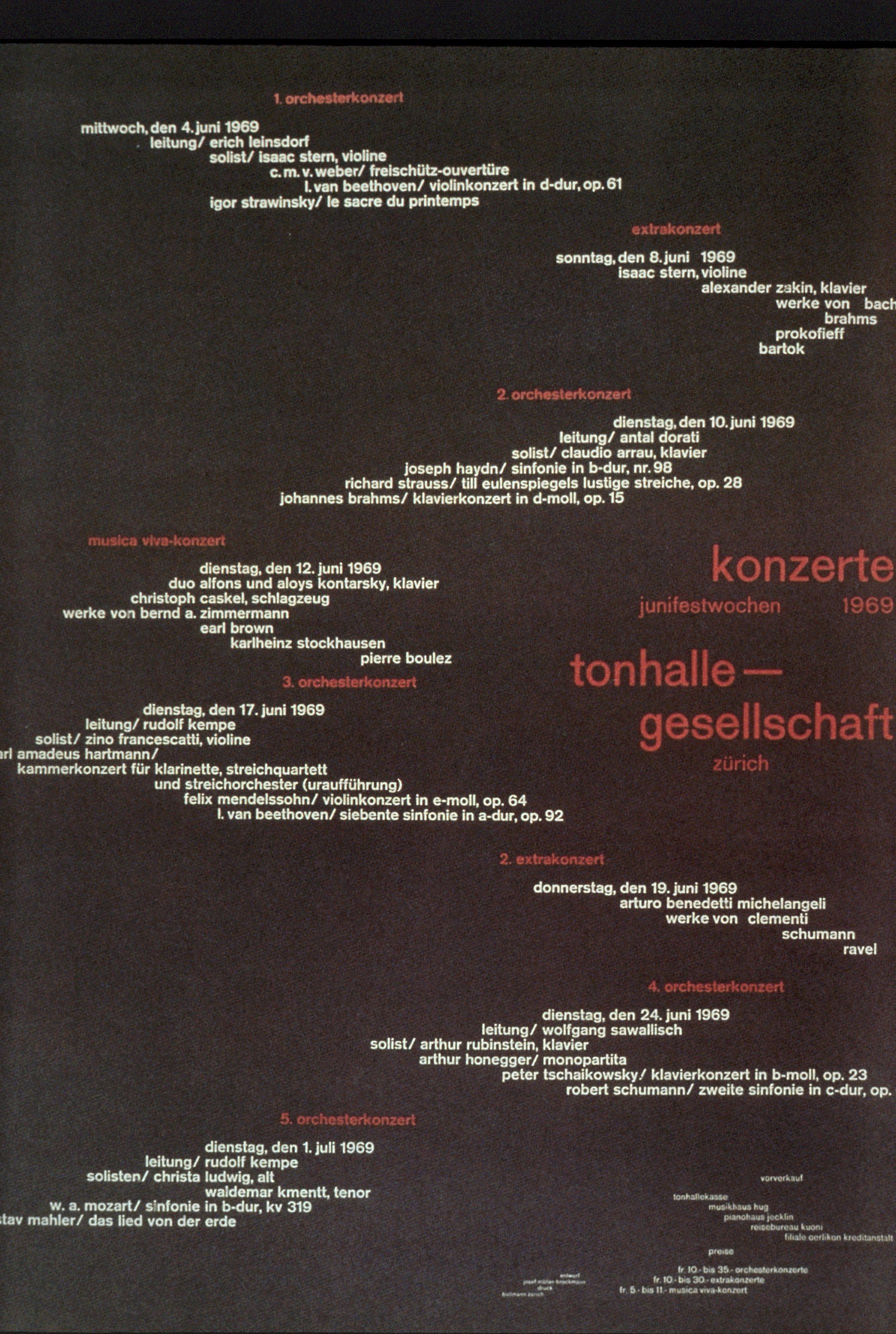
Konzerte Tonhalle – Gesellschaft, 1969
Douglass Scott was perhaps the most explicit in his exploration of the metaphor in poster design. His talk echoed the rhythm of a spoken word poem, while he spoke of poetry. Scott highlighted the linguistic devices that made up a poem while juxtaposing posters that expressed the same sentiment. The elements such as rhythm, meter, pattern and context which convey a great deal of nuance in poetry can be applied to poster design.
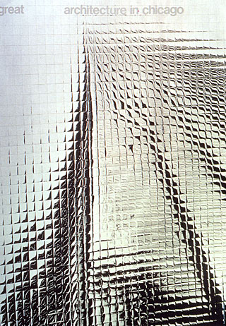
Architecture in Chicago, 1967
A poster for Architecture in Chicago appeared on the screen while Scott quoted poet Robert Frost’s, Education by Poetry:
“What I am pointing out is that unless you are at home in the metaphor, unless you have had your proper poetical education in the metaphor, you are not safe anywhere . Because you are not at ease with figurative values: you don’t know the metaphor in its strength and its weakness. You don’t know how far you may expect to ride it and when it may break down with you. You are not safe with science; you are not safe in history.”
Looking carefully at poster design we begin to understand the world around us for what it was, what it is and what it could be. The poster delivers nuance to history and context of cultures that are not our own. They can offer glimpses into Hindi cinema or post-war Poland. They can show trends and ideologies that repeat themselves throughout history. We can learn how to decipher the flood of images we encounter every day on the internet by using tools given to us through the work of designers like the Stenberg brothers or Josef Müller-Brockmann. A single piece of paper may seem a humble medium, but make no mistake, the power of the poster is enduring.
Article by Sarah Croughwell.
Sarah Croughwell is a User Experience Researcher at Motivis Learning and the Communications Director for AIGA Boston. Guided by curiosity, Sarah explores the intersection of design and the social sciences both in her work and in her observation. You can follow her on Twitter, Dribbble, and Instagram.
Introduction by Emily Hamre.
Emily Hamre is a web designer at Fort Point Design, and Vice President of Communications for AIGA Boston.
—
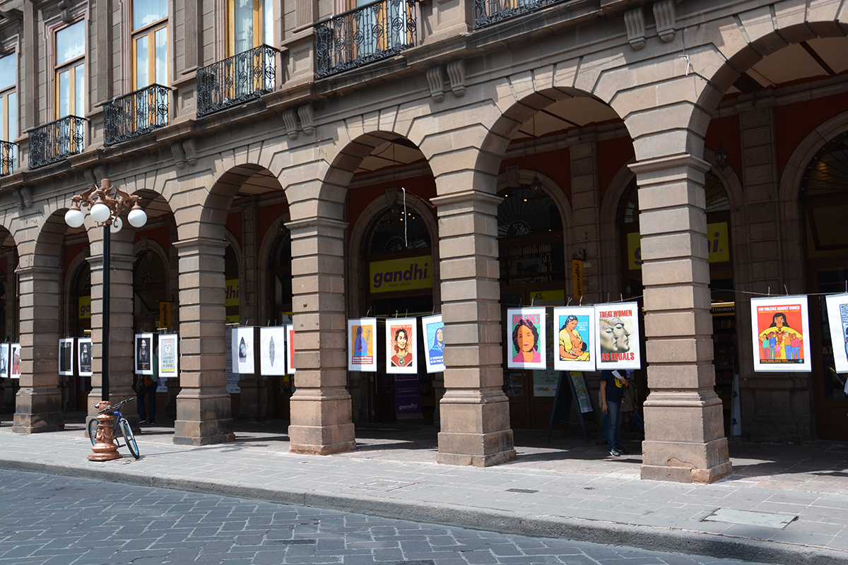
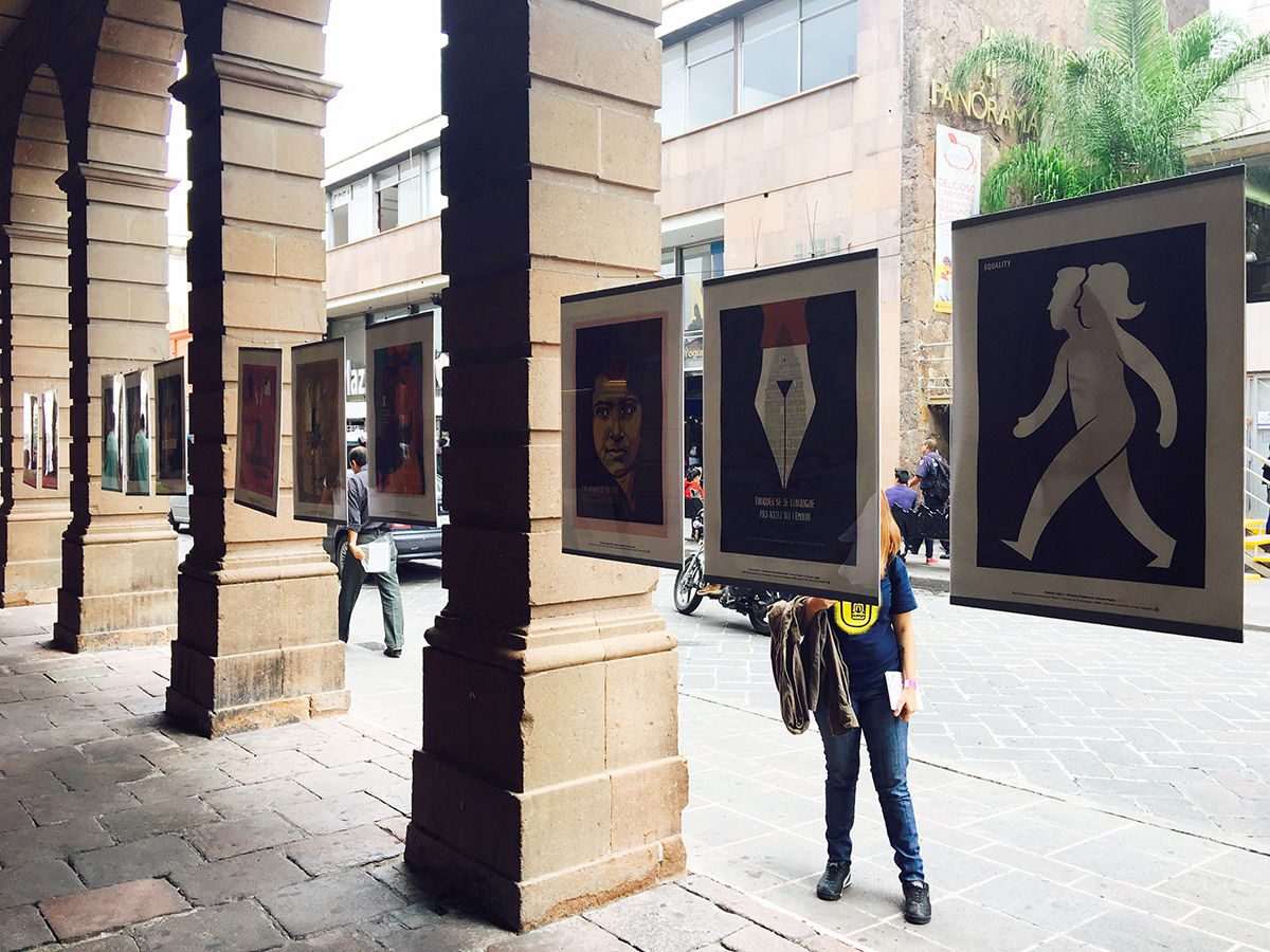
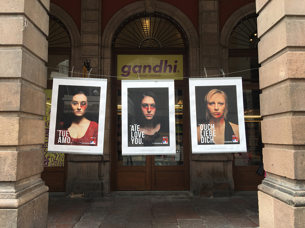
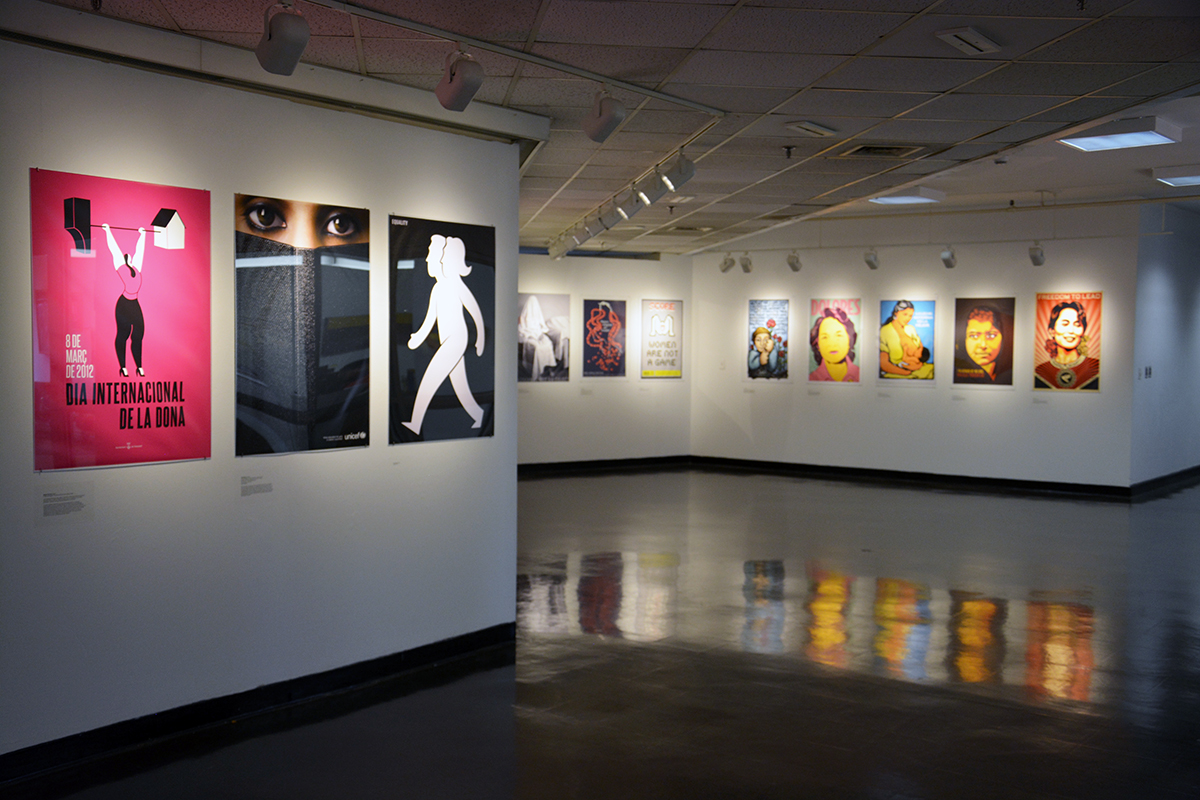
For those of you who attended the talk, you might be curious to see the setting in which Women’s Rights are Human Rights was displayed in San Luis Potosí, Mexico. After the event, Elizabeth Resnick, the show’s curator, spoke about how the posters were able to be displayed in the environment they were designed for, in a city square visible to the public. This display stands in contrast to the gallery walls where posters are often displayed today, as seen in the photo of the gallery at MassArt where the show was also featured.
—
We couldn’t have shared the poster-filled night that we did without the help of our fantastic sponsors MyFonts and Pixartprinting! Thanks to their generous donations we were able to give a poster away to each guest. Pixartprinting is an online printing service for creative professionals. These posters were printed and coated in a beautiful glossy coat. MyFonts has a fantastic collection of fonts, the world’s largest, in their online store.
Thank you to our event partner, MassArt, for hosting this event in their beautiful Design and Media Center.
—
Sources:
(In order of image)
See America, Welcome to Montana
I Want YOU
Mother India
Bobby
Man With a Movie Camera
The Burden of Marriage
Nie!
Keep Calm and Carry On
Keep Calm and Occupy London
French Motorcycle Poster
Art Gothic Specimen
Military Traffic
Brush Script Specimen
Midnight Cowboy (Polish)
Midnight Cowboy (American)
Treachery of Images
Poster of Tweed Coat
Wilhelm Tell
Adolf, the superman, swallows gold and spouts tin
Konzerte Tonhalle – Gesellschaft (Muller-Brokmann)
Bic Advertisement
Architecture in Chicago

